We recently completed the Home4Care project for Hearthstone Alzheimer Care, a company committed to meeting the evolving needs of people living with Alzheimer’s disease and dementia as well as supporting their families.
The goals were to combine the knowledge and processes Hearthstone had learned through their research with an easy to use interface for caregivers. The app offered specialized activities like games and quizzes, plus education for the caregivers and features for planning out their day.
Design Focus
The challenge of building an application whose goals included active use by people with dementia was unique and challenging for us. This was our first chance to expand upon our basic efforts at improving accessibility and making our sites and applications usable by as many people as possible.
While we’re familiar with WCAG guidelines, ARIA tags, and tools like contrast checker, we’re not experts on working with people with dementia and alzheimers. Fortunately, the team from Hearthstone is and proved to be invaluable resources in guiding our design efforts.
Initial Direction
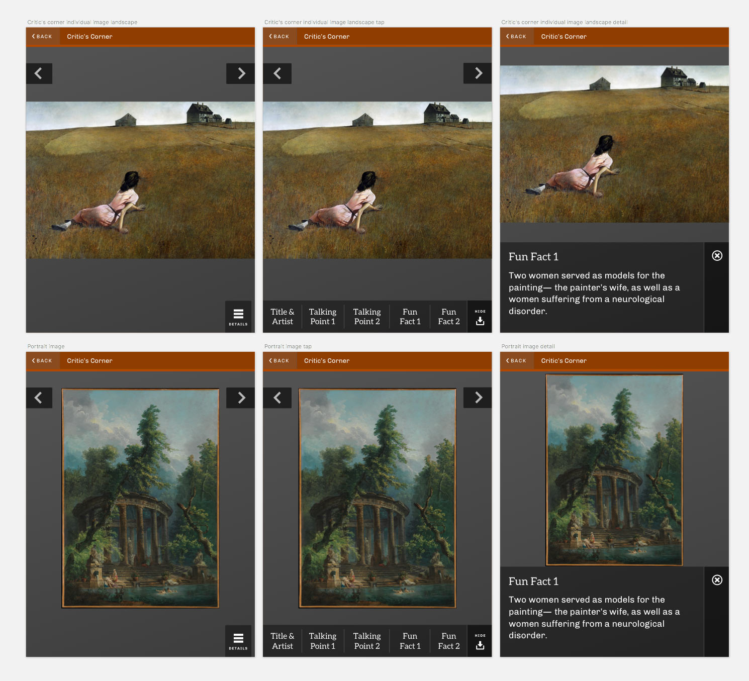
We started out the project the way we always do; with discussions and research. We wanted to employ an aesthetic and tone that was simple and modern, but also inviting for users (many of whom may not be tech savvy). We looked to other products in the same industry space, as well as well-designed pieces from elsewhere in medical fields, caregiving, and personal planning for inspiration.
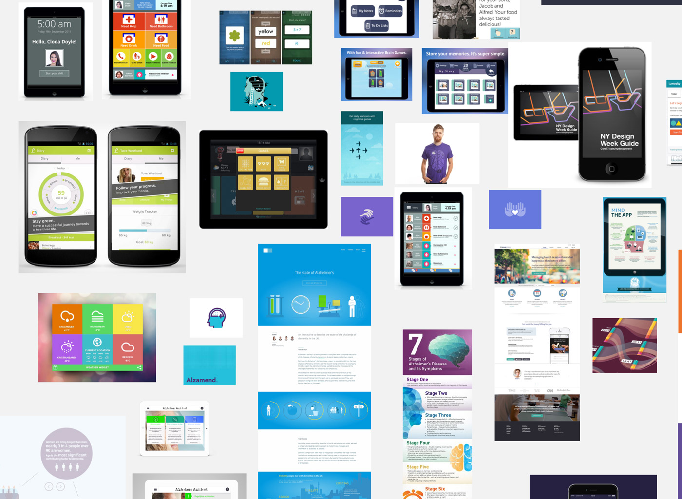
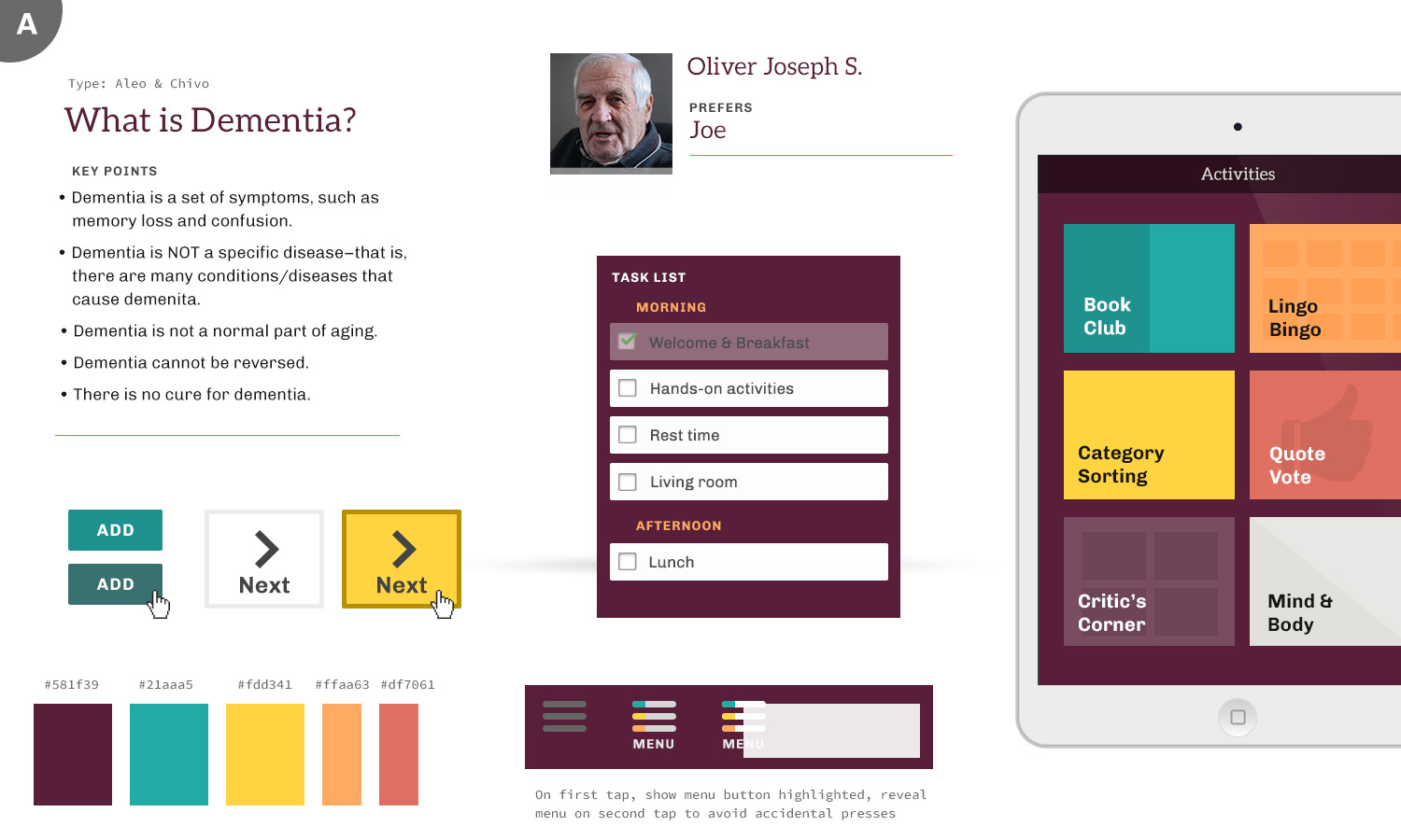
We drew upon that research to present several iterations of element collages to the Hearthstone team. One of our favorite deliverables, element collages are a way to explore how an application might look without getting caught up in implementation details or worrying about content.
Intentional Design
Included in our element collage documents is an entire page dedicated to the rationale and accessibility concerns of different design decisions we were suggesting. While there’s certainly subjective aspects to any design, we strongly feel that the best designs are not just visually appealing and on-brand, but are formed from well-researched and thoughtful decisions, backed up with solid rationale. To that end, we think that forcing ourselves to explain ourselves early on in the process is a tough but necessary step. We also test color combinations for recommended WCAG contrast and present the findings.
Moving Forward
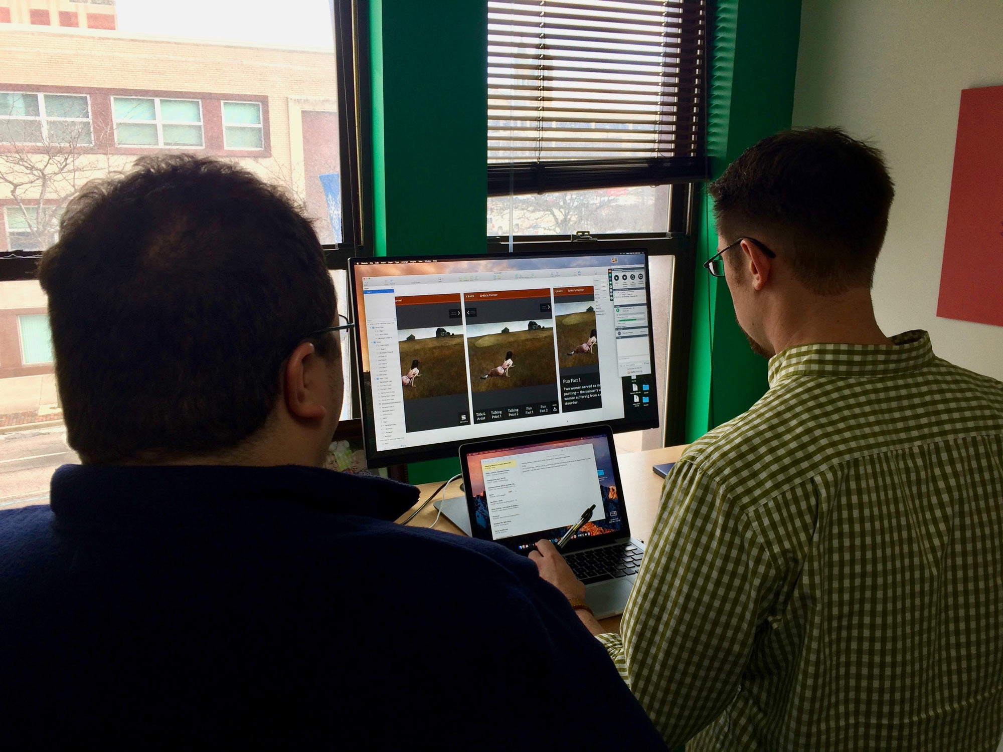
After some iterations through our initial designs, we quickly moved into applying these choices (colors, type, layout options) to some realistic content. We started out with a photo grid treatment for the home screen of the app – filling the screen with large touchable areas made sense and seemed like an elegant way to utilize what was essentially just 4 main options. We could update the layout based on screen orientation, and it would scale easily. When we talked through this with the Hearthstone team, we learned some valuable lessons.
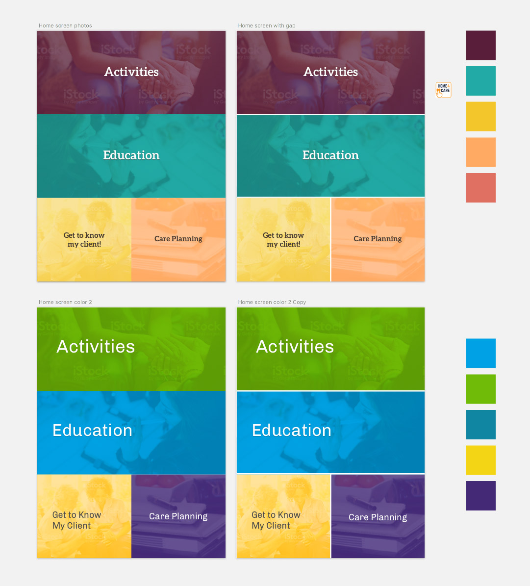
To potential users, large touchable areas probably wouldn’t be obvious as points of interaction. Furthermore, while we took the idea of stock-style photography as a nice way to create visual interest, it was brought up that users might take the imagery too literally, or be confused by the people and activities pictured.
Armed with a better understanding, we adjusted the starting screen to use four large, obvious buttons. Those conversations helped guide our decisions throughout the project.
Into the Details
As we designed and built the application, we found ourselves looking at some details more closely than we expected. We started the project using Aleo for headlines and button choices. It’s clean and legible, but being a mild slab serif gives it a little bit of personality which we thought helped the app feel more welcoming. Even though the serifs are fairly straightforward, the feedback was that certain users might struggle to quickly read the letters in some contexts. We transitioned to Rubik, a very simple sans-serif to be as clear as possible.
We also examined the usage of ligatures. Ligatures are the connecting glyphs between certain characters in a typeface.
They come from traditional typesetting; benefiting printing by simplifying the physical blocks that were required for frequent letter combinations. They remain in many digital forms as a nod to heritage, and give materials a traditional, stately look. We don’t usually give them second thought, but with clarity as our primary goal we chose to use font-variant-ligature in CSS to disable them, giving us a plainer, but from some studies measurably easier to read design.
Building a Design System
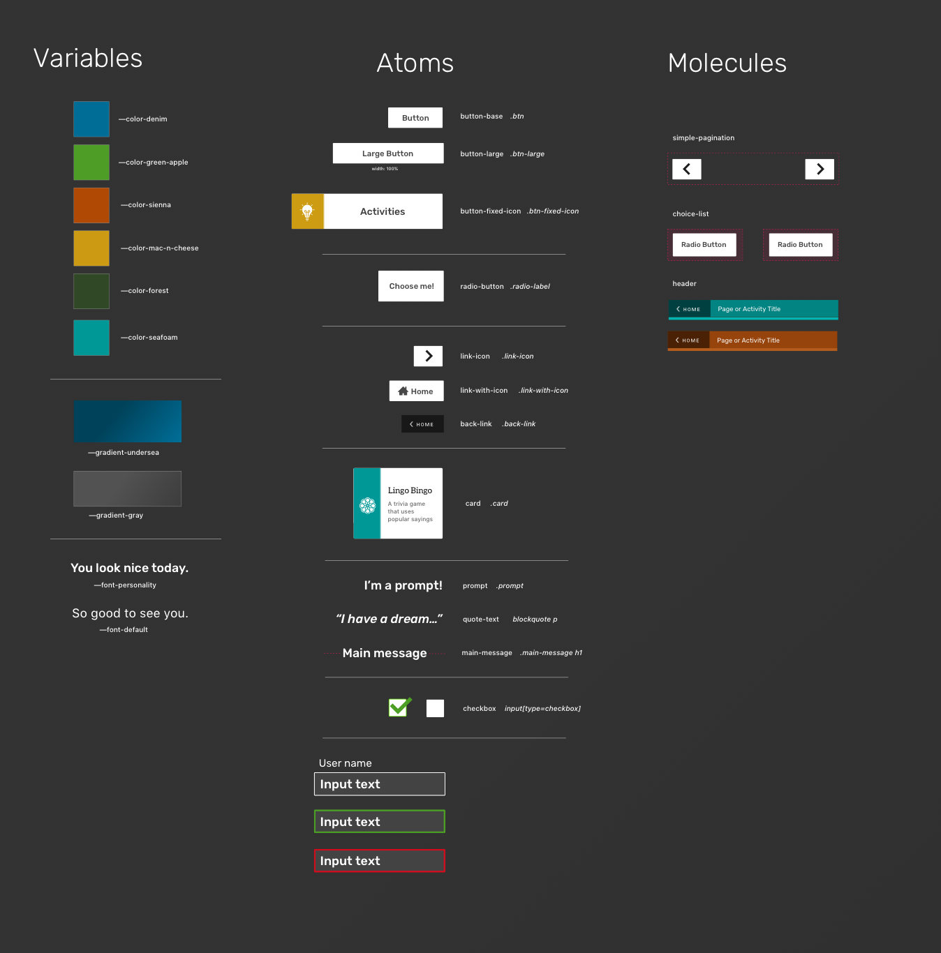
The actual nuts and bolts of designing different pieces for the application are where we leverage Atomic Design or similar systems. The goal is to create reusable elements that serve as building blocks for most common views and features of an application. Having such a pattern library established allowed us to build new things with consistency and speeds up development time greatly.
We had a lot of fun working with the talented team at Hearthstone Alzheimer Care on this project and hope this peek behind the scenes will help you think a bit differently on your own projects.
If you’re interested in some help along the way, we’re always interested in speaking to new clients. You can contact us at info@coffeeandcode.com.

