A Deep Dive into Home4Care’s Design

We recently completed the Home4Care project for Hearthstone Alzheimer Care, a company committed to meeting the evolving needs of people living with Alzheimer’s disease and dementia as well as supporting their families.

The goals were to combine the knowledge and processes Hearthstone had learned through their research with an easy to use interface for caregivers. The app offered specialized activities like games and quizzes, plus education for the caregivers and features for planning out their day.

Design Focus

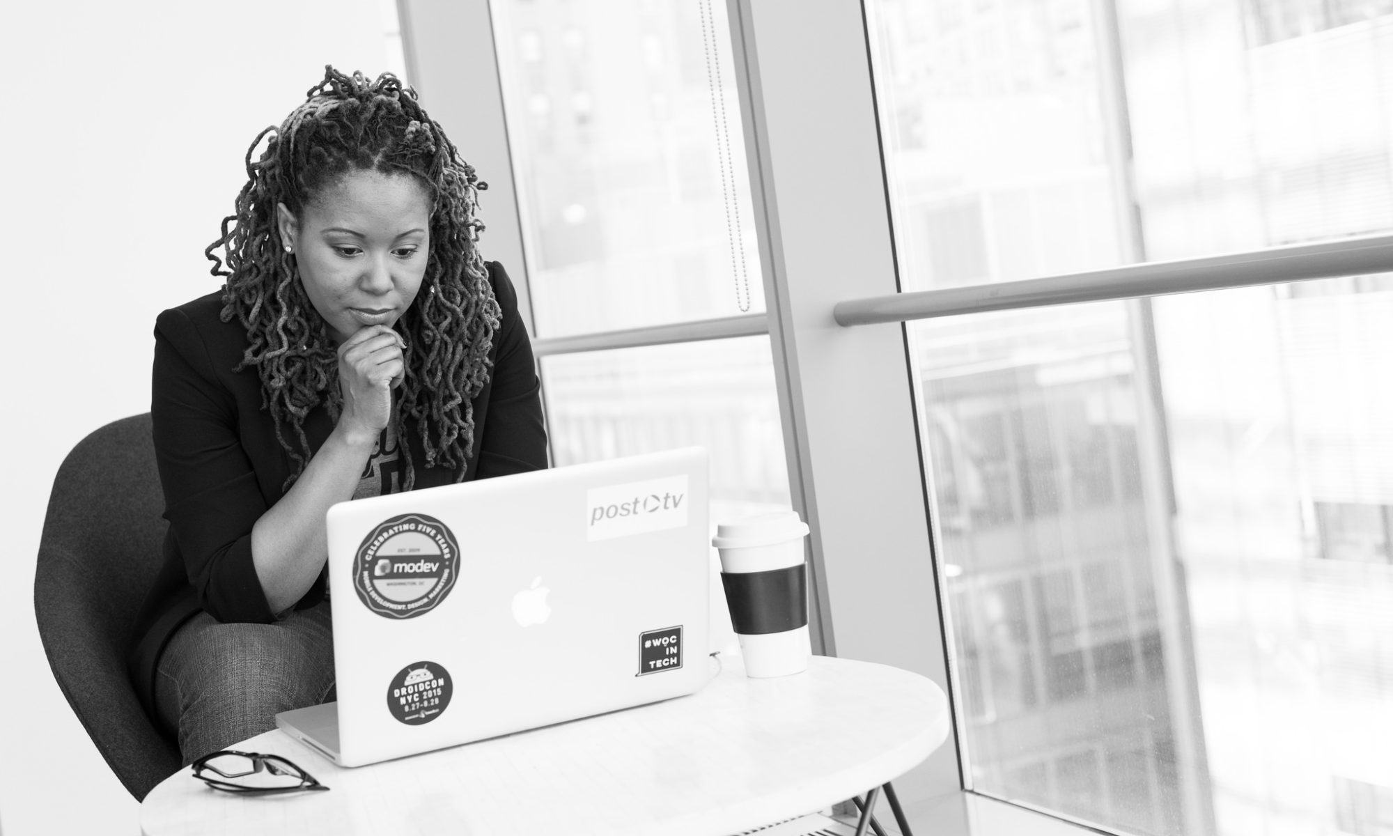
The challenge of building an application whose goals included active use by people with dementia was unique and challenging for us. This was our first chance to expand upon our basic efforts at improving accessibility and making our sites and applications usable by as many people as possible.

While we’re familiar with WCAG guidelines, ARIA tags, and tools like contrast checker, we’re not experts on working with people with dementia and alzheimers. Fortunately, the team from Hearthstone is and proved to be invaluable resources in guiding our design efforts.
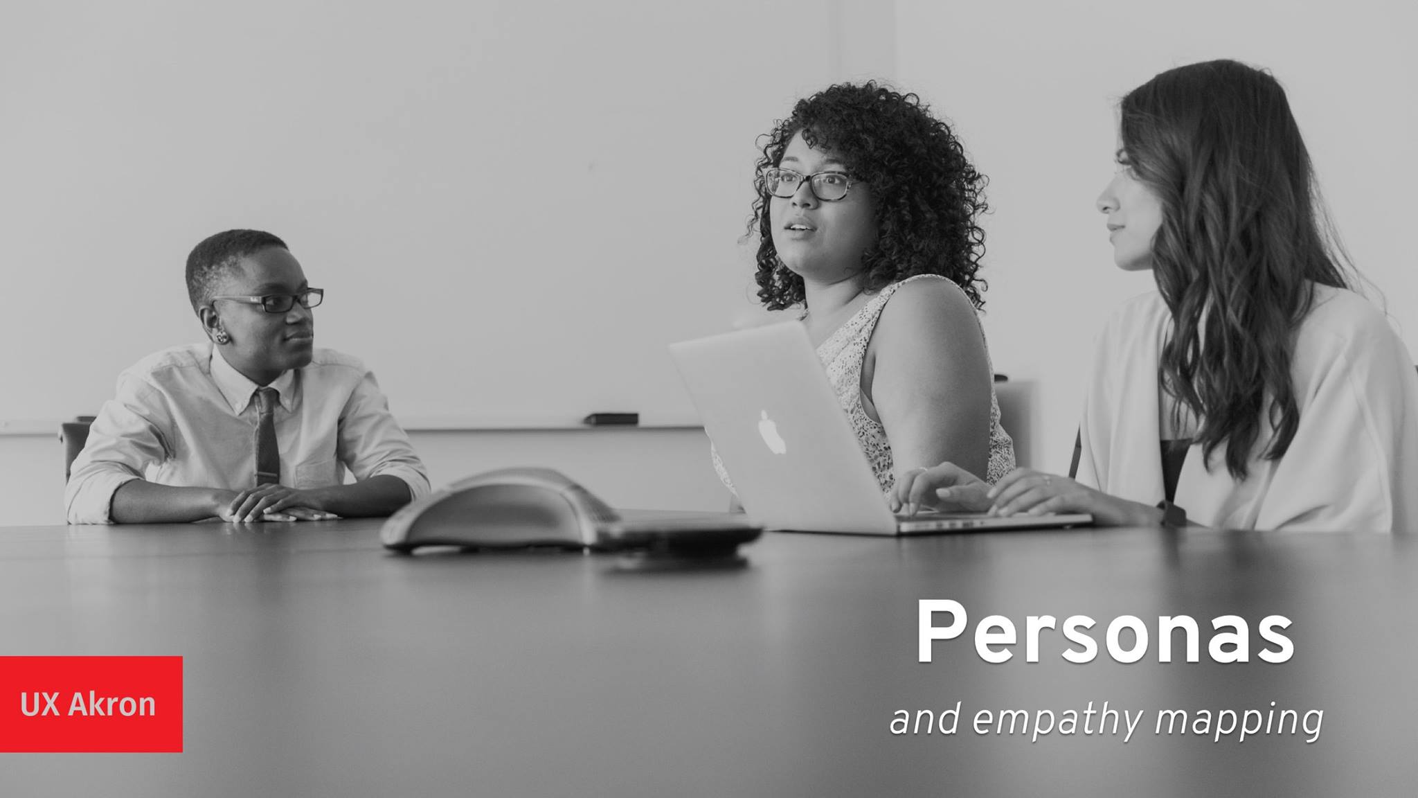
Critic

Initial Direction

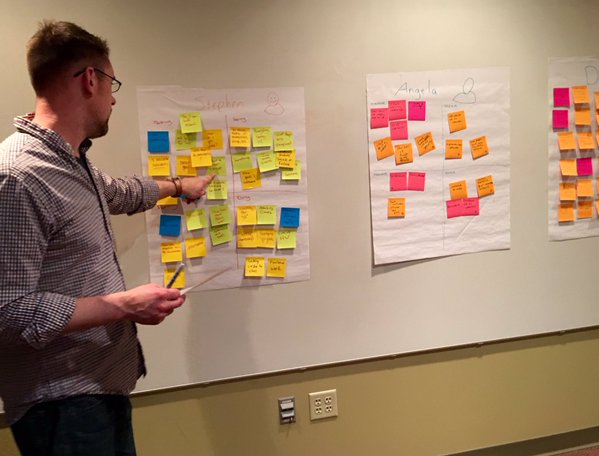
We started out the project the way we always do; with discussions and research. We wanted to employ an aesthetic and tone that was simple and modern, but also inviting for users (many of whom may not be tech savvy). We looked to other products in the same industry space, as well as well-designed pieces from elsewhere in medical fields, caregiving, and personal planning for inspiration.

research board

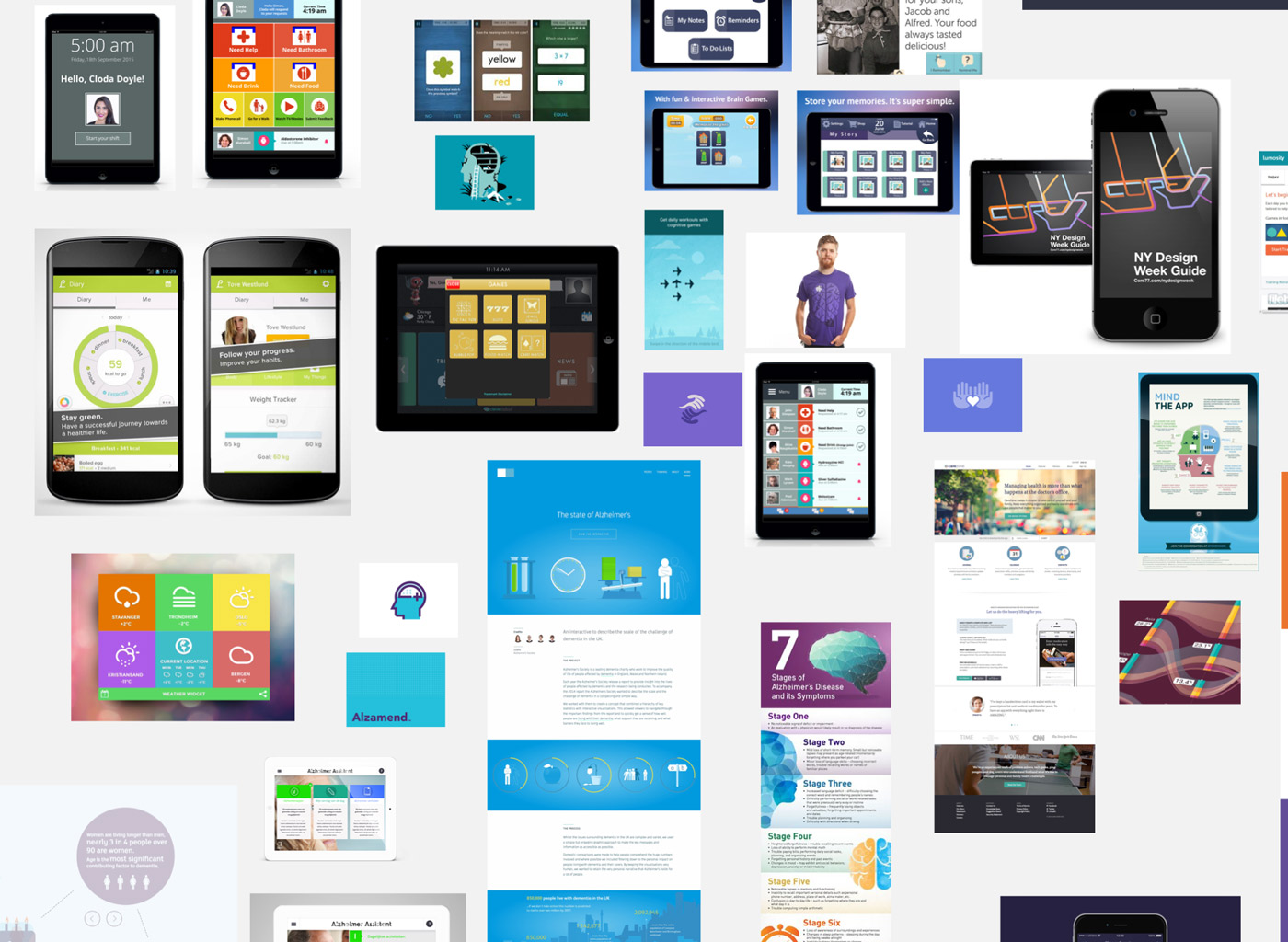
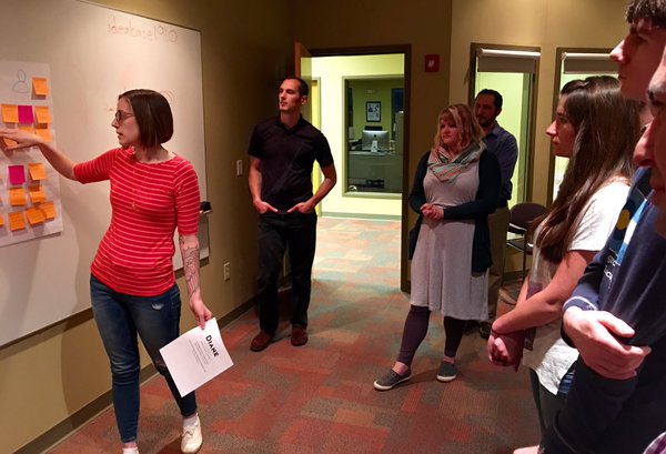
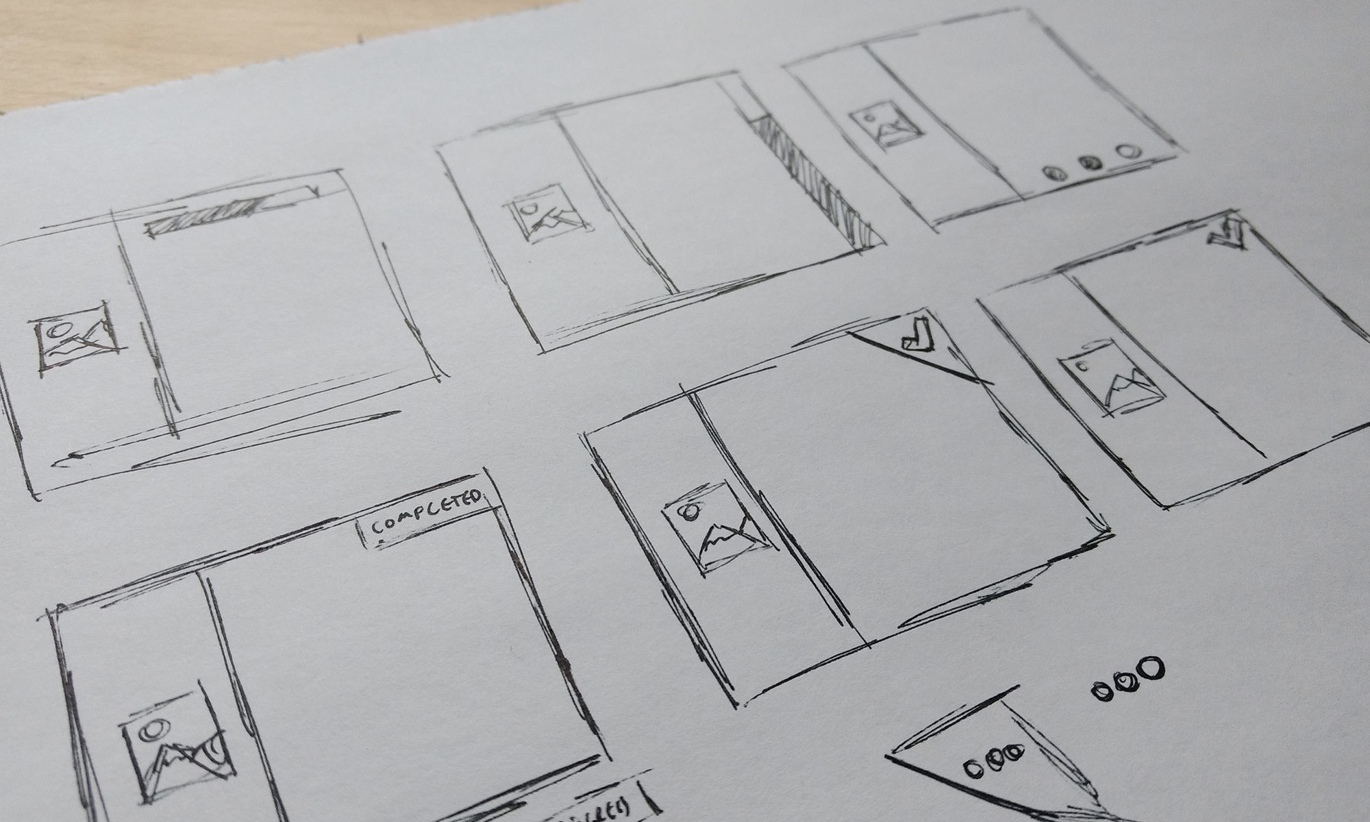
We drew upon that research to present several iterations of element collages to the Hearthstone team. One of our favorite deliverables, element collages are a way to explore how an application might look without getting caught up in implementation details or worrying about content.
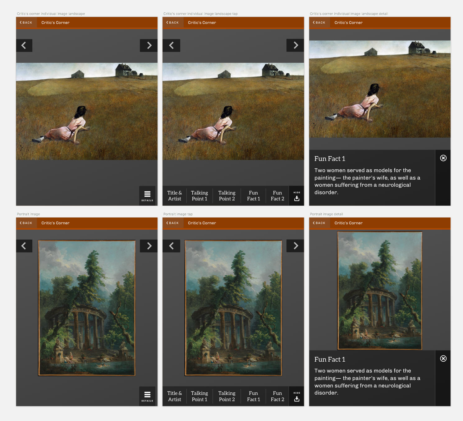
different ui elements

Intentional Design

Included in our element collage documents is an entire page dedicated to the rationale and accessibility concerns of different design decisions we were suggesting. While there’s certainly subjective aspects to any design, we strongly feel that the best designs are not just visually appealing and on-brand, but are formed from well-researched and thoughtful decisions, backed up with solid rationale. To that end, we think that forcing ourselves to explain ourselves early on in the process is a tough but necessary step. We also test color combinations for recommended WCAG contrast and present the findings.

Eric and Byron

Moving Forward

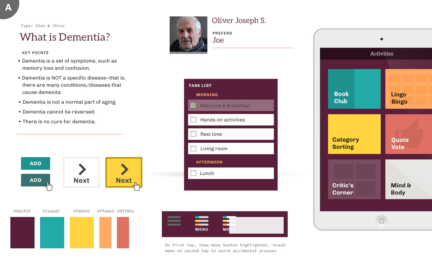
After some iterations through our initial designs, we quickly moved into applying these choices (colors, type, layout options) to some realistic content. We started out with a photo grid treatment for the home screen of the app – filling the screen with large touchable areas made sense and seemed like an elegant way to utilize what was essentially just 4 main options. We could update the layout based on screen orientation, and it would scale easily. When we talked through this with the Hearthstone team, we learned some valuable lessons.

menu with large clickable areas

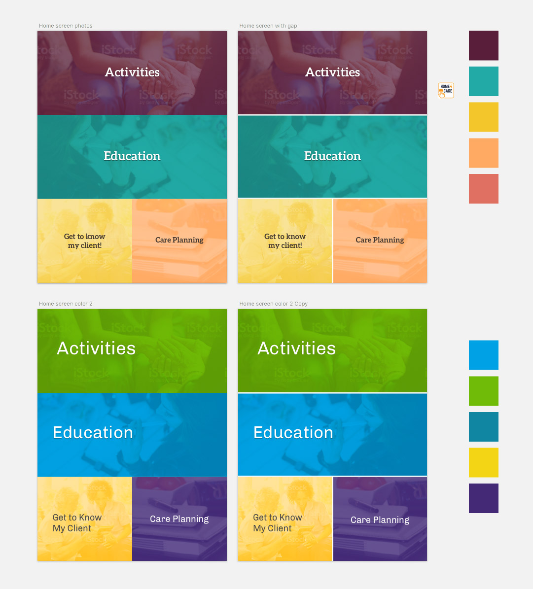
To potential users, large touchable areas probably wouldn’t be obvious as points of interaction. Furthermore, while we took the idea of stock-style photography as a nice way to create visual interest, it was brought up that users might take the imagery too literally, or be confused by the people and activities pictured.

Armed with a better understanding, we adjusted the starting screen to use four large, obvious buttons. Those conversations helped guide our decisions throughout the project.

Into the Details

As we designed and built the application, we found ourselves looking at some details more closely than we expected. We started the project using Aleo for headlines and button choices. It’s clean and legible, but being a mild slab serif gives it a little bit of personality which we thought helped the app feel more welcoming. Even though the serifs are fairly straightforward, the feedback was that certain users might struggle to quickly read the letters in some contexts. We transitioned to Rubik, a very simple sans-serif to be as clear as possible.

We also examined the usage of ligatures. Ligatures are the connecting glyphs between certain characters in a typeface.

ligature example

They come from traditional typesetting; benefiting printing by simplifying the physical blocks that were required for frequent letter combinations. They remain in many digital forms as a nod to heritage, and give materials a traditional, stately look. We don’t usually give them second thought, but with clarity as our primary goal we chose to use font-variant-ligature in CSS to disable them, giving us a plainer, but from some studies measurably easier to read design.

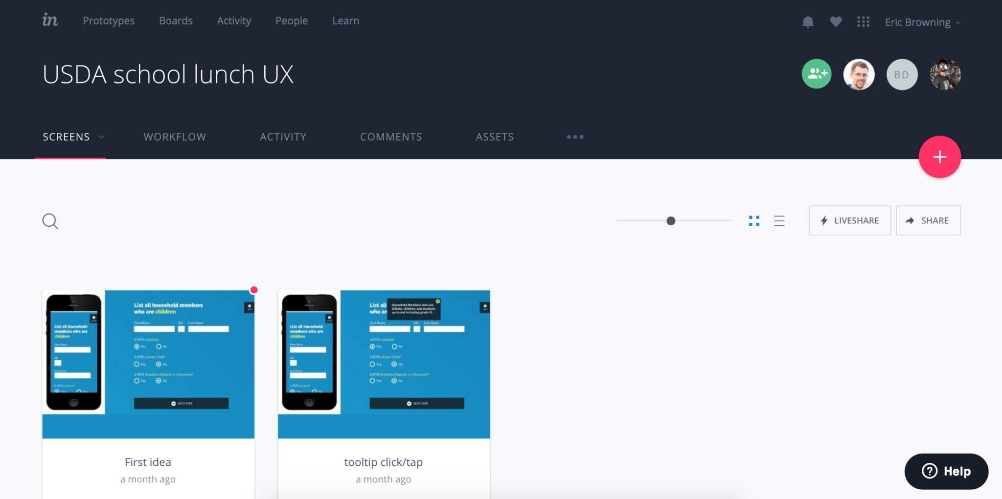
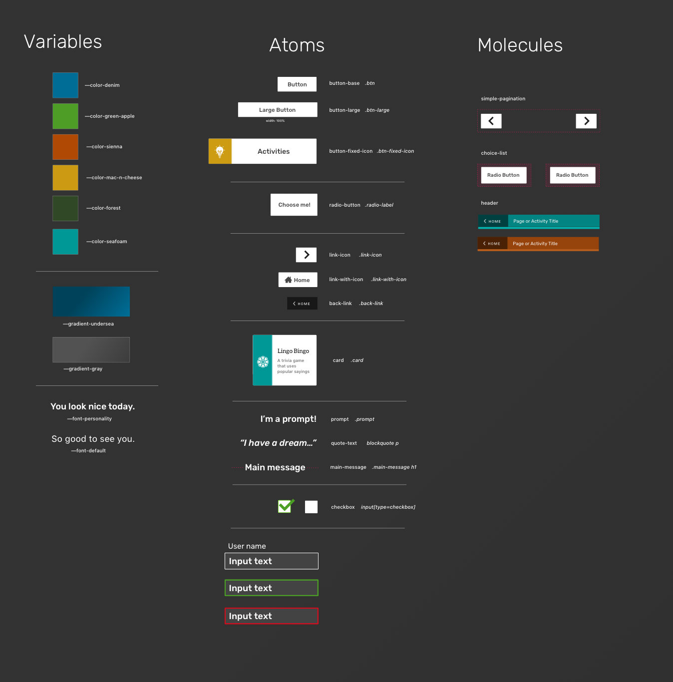
Building a Design System

The actual nuts and bolts of designing different pieces for the application are where we leverage Atomic Design or similar systems. The goal is to create reusable elements that serve as building blocks for most common views and features of an application. Having such a pattern library established allowed us to build new things with consistency and speeds up development time greatly.

atomic design elements


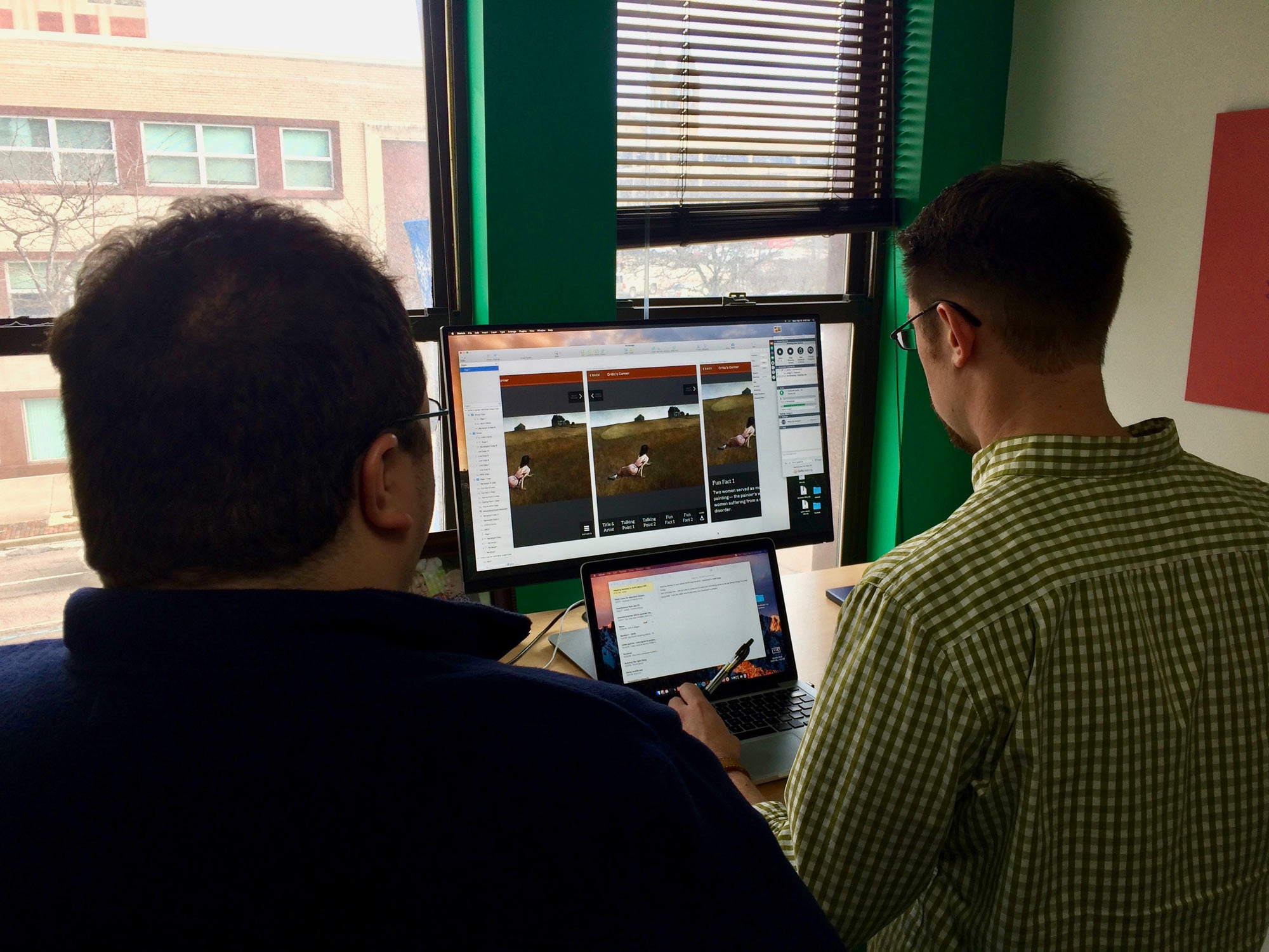
We had a lot of fun working with the talented team at Hearthstone Alzheimer Care on this project and hope this peek behind the scenes will help you think a bit differently on your own projects.

If you’re interested in some help along the way, we’re always interested in speaking to new clients. You can contact us at info@coffeeandcode.com.

Designing for Inclusion

A local company recently asked us to review their new application which focuses on parenting and childcare. They’re doing lots of things right and we wish them the best, but as I was going through their signup flow, something caught my eye.

The very first thing they ask as you fill in your (required) profile is “Gender” with the options “Male” or “Female”. This felt off to me, so I began researching so I could more eloquently explain myself.

There are a number of personal and life situations someone might be encountering that could make answering this a challenge, from gender identity questions to perhaps a single father not knowing if he needs to check female to be the “main/mother” on the account. Similarly, does a child with 2 parents of the same gender need different choices here?

The answer might be no to all of these, but consider that this is the first thing people have to answer about themselves. It could lead to complicated feelings and emotional responses; think about how that starts their journey with your application. Is that the right tone?

One of the best ways to avoid this is to consider if you really need to ask this information or could it be left out, or made optional later? Beyond gender, applying this test to anything you ask a user to provide is a valuable process. Why burden someone, or waste their time, or make them feel unwelcome?

Assuming you do need the information, you should offer a quick explanation in that section that explains how it’s used. Attached is an example of how Facebook explains what a user’s preferred pronoun is used for.

Pronoun usage explanation

It may seem like an edge case to you or possibly just ‘political correctness’, but this is such a simple way to address issues it’s not worth alienating even a small subset of your (potential) users.

Another idea is to offer more choices; not that anyone wants to feel like an ‘other’, but anything beyond a binary choice opens up paths to make people feel comfortable. Trying to go beyond to create a comprehensive list might even work for a particular situation, but it’s often riddled with challenges and limitations, as discussed in detail here.

When we think of accessibility, it’s often framed in terms of screen readers, valid code, and progressive enhancement techniques. I think there’s another layer we should be considering though, which is a less technical, more conceptual side. What we ask of users, and how we ask it can be just as important.

If you’re at all interested I recently read a great book that goes deeper into topics like this, Design for Real Life. I encourage you to check it out, as well as these other relevant links:

http://www.designprinciplesftw.com/collections/the-ten-principles-of-inclusive-web-design

http://blog.aarp.org/2015/08/26/how-the-americans-with-disabilities-act-benefits-all-of-us/

http://www.uxbooth.com/articles/women-on-top-inappropriate-dropdowns/

http://www.uxbooth.com/articles/inclusive-design-greater-identity-representation/

image courtesy http://www.wocintechchat.com

Talking About Design Feedback at Stir Trek 2016

Last week I had the opportunity to speak again at Stir Trek, a yearly conference held in Columbus at a large multiplex theatre. It’s a one-day event with 6 different ‘tracks’ of speakers. You finish up after the sessions with a showing of the latest Marvel movie (or Star Trek, etc). It’s a great event; organized and run very well, and the cost is very reasonable.

My talk this year was on how to give design feedback. Specifically, how to give useful feedback when you’re not a designer. It was a tough topic to prepare, because I had to research and work through the problem myself; it’s something that’s been troubling me for a number of years.

I took the risk of keeping the presentation short, allowing 20 minutes for a mini-workshop getting actual critiques from attendees. The goal was to ask attendees how they’d respond in example design critiques using the advice from my talk. I also had a 1:00pm time slot and crowd interaction allowed me to fight off post lunch food comas as best as I could.

I can happily report that it went very well. Things ran smoothly, there was plenty of audience participation (and it was ~80% developers!), and I had some nice discussions afterward.

After the conference, I spotted this great review and among the retweets and mentions were these awesome sketch notes:

There’s much more to learn and share around feedback, so I look forward to hopefully giving a similar presentation again and discussing with more people.

My slides are available here. If you’re interested in a live presentation of this talk, please reach out to eric@coffeeandcode.com!

Talking Personas and Empathy Mapping with UX Akron

I had the great opportunity last week to give a short presentation at UX Akron, and lead a small workshop on personas and empathy mapping.

A persona is simply a fictional character (or set of them) your team creates to serve as a snapshot of your audience. The idea is to take things like demographics, goals, wants and needs and give them a relatable human presence. It’s much easier for us to be empathetic when we’re discussing ‘someone’ rather than just ‘our users’ or some other more abstract reference.

Empathy mapping is an exercise used to get in the mindset of your users, helping you to think and act like they would. You take one of your target users, and divide up a sheet into quadrants: thinking, feeling, seeing, and doing. You brainstorm different ideas with sticky notes for each section to help build a snapshot of this user at this point in time.

Our goal was to learn a bit about personas, and then look at personas that have been created for the UX Akron group. We used empathy mapping to understand the thoughts and motivations each of those personas was experiencing as they were thinking “I’m considering going to a UX meetup”. We looked at our results and it led to some quick ideas on how the group is missing marketing opportunities, or might structure its messaging to better appeal to certain groups.

Overall it was a great night with a diverse group. I look forward to attending as a regular member, and hopefully speaking again in the future.

If you’re looking to learn more about a current design topic, let us know at info@coffeeandcode.com We’re booking speaking and workshop engagements now for Fall and Winter 2016.

Photos credit UX Akron & WOCinTech

Choosing a Prototype and Wireframe Tool in 2016

The past few years have seen an explosion of interest, usage, and growth in using interactive prototypes to build, evaluate, and iterate on design work. Coupled with the rise in style guides and atomic design, the prototype is now often the primary deliverable many designers create.

Thankfully, the tools to create prototypes have kept pace; there are myriad choices available, with something new posted with shocking frequency on design blogs. How do you select a tool for your workflow? What are the pros and cons of different types of software? I’ve prepared some notes to help guide you, and focus your search. I was inspired to do this after a great session prompted by UX Akron.

Before getting much further, I’d like to address wireframes. Though the term has fallen out of favor lately, I think that wireframes are still incredibly relevant and useful. The difference between a rough prototype and a clickable wireframe is just terminology. I don’t believe wireframes need to be static, nor do I think prototypes need a certain level of fidelity. The differences seem largely semantic and based on industry zeitgeist. The level of fidelity should be based on the project and your needs, not a pre-determined bias.

Types of Prototype Tools

There are 3 main categories that modern tools fall into:

  • Screen or page focused
  • State or layer focused
  • Code focused

Some tools are a hybrid of these, but it makes it simpler to divide our choices up and evaluate them that way.

InVision screnshot

Screen or page focused

In a nutshell, these let you create pages and/or import static images and then easily create hotspots to link to other pages. This can sometimes be automated so that whenever your design files are updated so are your prototype screens.

How much interaction you can add, and the level of animation is somewhat limited, but the upside is that these tools are extremely easy to get up and running with. They’re an ideal choice for a scenario where you need higher fidelity than just boxes and text; if you’re adding features to an existing app for instance. Conversely though, tools like Balsamiq are page based with the goal of keeping things lo-fi, so there are options on both ends of the spectrum. I also include Keynote and PowerPoint, which weren’t designed as prototyping tools but have plenty of functionality to work, and work quickly.

Popular page/screen focused tools are Balsamiq, InVision, Flinto, Marvel, Fluid UI, Keynote, and PowerPoint.

OmniGraffle screenshot

State or layer focused

In contrast are tools focused on changing states, or layers. You can have multiple layers on a single page, dynamic states within a single layer, variables/conditionals for elements, and fairly detailed control for time-based animations and interactions.

With all of this, you’re afforded more control than page-based tools including the ability to link between pages/views in more complex ways. But they tend to be more expensive and complex due to an extensive feature list, bringing a larger learning curve.

Some tools I lump into this category are Axure, OmniGraffle, Proto.io, Pixate, and Indigo Studio.

Code focused

The last group are basically libraries that help you when creating prototypes programmatically. This gives you essentially complete control over prototypes.

Creating prototypes this way can help communicate your ideas easily to developers, because the developers can look into the code and possibly translate it into production quality code, or at least understand the intention behind it.

The challenges with this are that it’s highly dependent upon your programming skills. It’s also often more difficult to share and present with other members of your team, since there aren’t typically built in web viewers or presentation wrappers.

Quartz Composer with Origami and Framer JS are two examples of tools that fall into this category.

So what’s the best tool?

The short answer is obviously that it depends… Each project will have different needs, and you or your team (or clients) will have different requirements too.

With that being said, I turn to screen based tools first, specifically InVision. My experience is as a designer so having synced files from Sketch or Photoshop is incredibly handy and lets me explore ideas quickly. The prototyping and animation features are limited, but it fits the use cases I’ve had, and having such a low learning curve is wonderful for a working professional.

If there’s a need for a larger prototype I’ve used Axure as well. Visual fidelity wasn’t the goal, but for pure prototyping its organization with complex projects and the ability for team members to collaborate was invaluable.

Don’t worry (too much) about the software

Ultimately, any of the tools here (and all of those that I missed) will allow you to build prototypes. The most important things are the process and your communication; no tools can overcome those. Showing your team a rough prototype early on is much more valuable than spending days getting something perfect, only to realize you’re too late in the process and the project has already moved forward. Explore the options, find something you like, and do great work.

Prioritizing Performance: Completing a performance audit using Web Page Test

Optimizing a website for performance is hard, but that’s what makes it fun! When you plan to accomplish a goal, it’s never a good idea to go from 0 to 100 immediately. Whether it’s running a marathon, getting out of debt, or learning to wake up early in the morning – you have to take things one step at a time. This applies to improving performance as much as it does to these other examples.

The first step to improving your site’s performance is to establish a baseline of where it is at today. What we’ll need to do is a performance audit. This is an in-depth, instantaneous look at the performance of a website.

Enter Web Page Test

Web Page Test provides you with a very detailed view of what’s happening on your website. Here are a couple key metrics that you need to pull out and begin to document:

  1. Load Time (Document Complete Time)
  2. Time to First Byte *
  3. Start Render
  4. Speed Index **
  5. Fully Loaded Time

These are the high level items that you’ll want to be able to reference, but for this audit we’ll go a bit more in-depth to see what’s really going on behind the scenes. To do so, we’ll need to track data from each call that is made from the site. From each call, we’ll want to know:

  1. Mime Type
  2. URL
  3. Size (KB)
  4. Request Start Time
  5. DNS Lookup Time
  6. Initial connection time
  7. Time to First Byte
  8. Content Download Time
  9. Total Time Taken

Once you’ve arranged all of this data in a spreadsheet I’m sure your first question is something like this:

What does all of this data mean!?

You, probaby

With this information we’ll be able to pinpoint exact situations where we can improve, we just need to know what to look for. Let’s look at a quick example to outline a scenario that we should be looking for:

SVG Chart Example

Here we can see that we’re loading in 5 SVG images. These images take a total of 597ms to perform a DNS lookup, establish a connection, and wait for a first byte. That means that half a second went by, and we haven’t even started to download these images! Granted, some of these things could be happening synchronously, but we can all agree that it’s a bit of a waste for five images that take 0ms to actually load because of their small size. An easy improvement to this is to create a sprite sheet, reducing all of the inherent network latency involved in calling a server five times over again into one call.

For those unfamiliar:

[Sprite Sheets] are important for website optimization because they combine several images into one image file to reduce HTTP requests.

From Guil Hernandez at the Team Treehouse Blog

Please keep in mind that the sprite sheet optimization technique (hack?) is for a website following the HTTP 1.x protocol. This is considered an anti-pattern in the newer HTTP2 protocol. You can read about the HTTP2 protocol here. For a more concise translation regarding the switch from HTTP1.x to HTTP2 check out this post by Matt Wilcox

This scenario should hopefully give you an insight into what we’re looking for as we sift through this data. Every site and scenario will be unique, so I’ll let you dissect away!

When all is said and done, you should be able to get some valuable data by aggregating the call times by sections. Ours came out looking like this (Y-Axis is time in milliseconds):
Performance Graph

Are you noticing a lot of initial connection and time to first byte time, but not a lot of content download time? It seems like you might want to try combining some assets to make less HTTP requests! Are you seeing high content download times? You might want to try compressing your assets to decrease their size to a more reasonable level!

Hopefully with this information you’re ready to audit your own website and begin prioritizing performance!


* If you’re using a CDN like CloudFlare and Gzipping your files, you shouldn’t be worrying about the Time To First Byte metric as stated in this post by Cloudflare themselves.

** The math behind a Speed Index Score is very interesting, and best described in this page in the Web Page Test documentation.

Codemash 2016 As a Designer – Pushing Yourself to Learn and Grow

I will admit that I had some trepidation about registering for this year’s Codemash conference. I wasn’t worried about the conference overall, which is always wonderfully organized, presented, and planned but rather the content of the presentations themselves.

I’m a designer; user-focused design is what I do daily (and occasionally nightly) for clients at Coffee and Code. Codemash, as you can guess from the name, is a developer focused conference. Last year there were a good number of talks geared towards designers and front end developers; I learned about animation, illustration, and style guides. I was even fortunate enough to give one myself on a modern design process. This year though the talk abstracts seemed to fall more squarely in the coding realm and anything related to design and UX was more of an introduction for developers.

My teammates convinced me to sign up; they made the important point that any concerns over the content wouldn’t matter when you consider the value of such a large conference that’s so close to us and so accessible. We want to support Codemash and the community, and worse case scenario… I could hang out by the waterslides drinking Kalahari Sunrises!

As I looked over the schedule and planned out my days, I took the opportunity to see some truly wonderful talks; most of which had nothing to do directly with design.

Some highlights were:

How Do We Solve for XX?

There was an excitement in the room before this talk like none of the others I went to. The (wonderfully diverse) crowd seemed very eager to get started as the lack of women in the web/technology field, with the alienation and attrition of those that are our coworkers, is a huge problem for our industry.

Kate Catlin (@Kate_catlin) was a wonderful speaker, really more of a leader for this interactive session. Her energy and boldness helped take this beyond a typical “we need more women” discussion and toward “what can all of us actually do?”

She began by discussing her background, and some shocking numbers regarding female tech workers.

The amazing moments came as we were split into groups; each trying to tackle one step of the pipeline problem, from young girls being discouraged from STEM interests to existing women feeling isolated and excluded in their careers and workplaces. We brainstormed ideas and everyone shared their experiences. Women, men, native English speakers and not, those from traditional tech backgrounds, and those who switched careers later in life.

It was eye opening to listen to all the experiences and be exposed to some of the privileges that are so easy to be unaware of. The great thing though was that it wasn’t a complaint-fest, there was a hopeful tone throughout and some great ideas to try and actually implement in our own communities.

This session was hugely beneficial to me in the form of empathy. As a designer there are few things more important than that.

A Web for Everyone

I’ve often approached accessibility in web projects the way I think many others have; follow basic best practices… and hope for the best beyond that.

Dylan Barrell (@dylanbarrell) led this discussion, sharing what he had learned leading accessibility studies and audits over the past few years.

What was brilliant about this presentation was a blindfolded walkthrough of some sites using screen readers. Far more powerful than reading a spec and following guidelines, it was eye-opening to experience how visually impaired users consume the things we build.

The other “wow” moment in this talk came from a first hand demonstration of the way a visually impaired – but not blind user used the web. She doesn’t use a screen reader, but instead relies heavily on magnification tools and context hints like color and contrast. It’s incredibly easy for us to assume accessibility == screen readers, ignoring users who have different levels of vision and possibly additional challenges, perhaps auditory, cognitive, or physical dexterity. Building in an accessible way is a complex challenge, but also incredibly important and one I hope we can make more of a priority moving forward as an industry.

Finally, a Voice for the Enterprise!

“Hey Alexa, tell me how our servers are doing.”

Voice command interfaces like Siri, Google Now, Cortana, and Amazon’s Echo are growing every day. It’s entirely conceivable that soon “interfaces” will be far less visual than I’m used to building, and voice and other tactile inputs will be how we work with them.

William Klos (@williamklos) led this session, which was as much real demo as it was discussion. He contrasted the different systems available today, and talked about the roadmap for new developments.

This presentation showed what we can do right now; customizing the Amazon Echo to run custom code, complete tasks and interact with users. There are a number of pitfalls and shortcomings, but it’s clear that leveraging technology like this is only going to be more widespread. How you work with the APIs, and how you structure your voice interactions was really illuminating – it’s interface design, but much different than what I’m used to doing.

Conclusion

The overarching theme to all of this was that I learned the benefit of thinking in a different way and becoming a more well rounded learner. I could have easily gone to a different conference and learned about Atomic Design, or new prototyping tools, or new type systems but instead I pushed myself in interesting ways and came away a better designer and human. Couple that with good times with friends, board games, and an indoor waterpark and I couldn’t have asked for a better Codemash.

Recap: Ethan Marcotte – Responsive Design

This is a recap of the workshop Ethan Marcotte – Responsive Design given on November 5th, 2015. This workshop was the sixth installment of the Build Right Maker Series given by Sparkbox.

We are no strangers to the awesome workshops that our friends at Sparkbox have curated. As a company, this marks the fourth time that we’ve been to one of their events. If you haven’t heard of or been to an event that they’ve hosted, we recommend looking into them. They make the round trip drive from Akron to Dayton in one day (almost) worth it. We recommend getting a hotel.

One thing that I’d like to give a shout-out to before we begin is the food and drinks! From the awesome pastries and Qdoba burrito bar, to the bartender on the rooftop afterparty, this event was filling!

Calories aside, we really enjoyed hearing Ethan speak on his forte. For those of you who don’t know, Ethan Marcotte literally wrote the book on responsive design. A five year old book, it’s still considered required reading for web developers and designers and we have absolutely no problem promoting it.

responsive design book by Ethan Marcotte

We have obviously known of Ethan’s work for some time now, and that was why we were so excited to hear him speak. We wanted to see what he was doing today, and if his thoughts still stood the same regarding responsive design.

To no surprise, he still stands by his three technical ingredients required for responsive design:

  1. Fluid grids
  2. Flexible images
  3. Media queries

Ethan is confident that when combining these three things, a responsive design is easily implemented on the web, and we agree!

You have probably seen flexible grids from technologies such as Bootstrap, and flexible images by adding max-width: 100%; to your img tag styles, but what about media queries? How many of us have truly looked into the capabilities of media queries? Side note: Extra credit for those excited about Element Queries!

For those who are unfamiliar:

The @media rule is used to define different style rules for different media types/devices.

From W3C at w3schools.com

Ethan broke media queries out into two different classes, and we enjoyed the explanations. The first class of media queries are the major queries. These queries define where larger layout changes occur on a web page. The next class, the minor queries, are used to adjust line heights or font sizes as a page size is reduced.


One subject that seems to come up with Ethan a lot is content strategy. An exercise that we did was to take a website, divide it into its content, ignore its layout, and make a single lane priority for it. It’s a very difficult exercise! Could you decide whether a promotion was a higher priority than a logo? What about if a logo was a higher priority than a sign-on form? Very thought provoking!


condition and feature grid

Next, we came to the idea of designing not for a device screen, but for an infinite space. Several times we found ourselves asking questions like:

How will this look on a tablet?
or
How would this look on a phone?

When we should really be asking ourselves questions like:

How would this look on a medium sized touch screen with a spotty, high latency connection?

A big take-away that we had was to stop referring to devices as anything more than conditions and features and that using terms such as “tablet” and “mobile” were doing a disservice to our industry.

This spiked an awesome conversation regarding the sustainability of your design / code when a network is unstable and causes a resource failure. What if your website never loaded your CSS? This quote was particularly interesting:
reliability quote

Like cars designed to perform in extreme heat or on icy roads, websites should be built to face the reality of the web’s inherent variability

From Trent Walton in his article Device Agnostic</cite

This is a very specific topic that we haven’t been able to stop thinking about. What if a stylesheet never loaded? What does our bare layout look like? What happens when a browser in non-ideal conditions prioritizes our content over our images? Does our site still hold up? Can someone with a sub-par phone view the content that we have put out? Do they have a (relatively) similar experience as another person on a large screen with mouse on a fast and reliable connection? If not, why?

Hopefully this can spark some thought with you, and you can start to ask these questions about your own designs or code.


Yet another side note: Sparkbox is located a block away from an awesome place called Proto Build Bar. They have the world’s largest claw machine. We don’t want to hold any judgement, but Eric’s z-axis perception needs some work. He’s the only one of us that didn’t go home with an inflatable ball:

claw machine