Designing for Inclusion

A local company recently asked us to review their new application which focuses on parenting and childcare. They’re doing lots of things right and we wish them the best, but as I was going through their signup flow, something caught my eye.

The very first thing they ask as you fill in your (required) profile is “Gender” with the options “Male” or “Female”. This felt off to me, so I began researching so I could more eloquently explain myself.

There are a number of personal and life situations someone might be encountering that could make answering this a challenge, from gender identity questions to perhaps a single father not knowing if he needs to check female to be the “main/mother” on the account. Similarly, does a child with 2 parents of the same gender need different choices here?

The answer might be no to all of these, but consider that this is the first thing people have to answer about themselves. It could lead to complicated feelings and emotional responses; think about how that starts their journey with your application. Is that the right tone?

One of the best ways to avoid this is to consider if you really need to ask this information or could it be left out, or made optional later? Beyond gender, applying this test to anything you ask a user to provide is a valuable process. Why burden someone, or waste their time, or make them feel unwelcome?

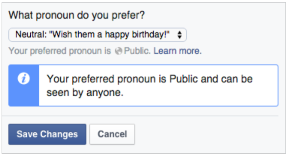
Assuming you do need the information, you should offer a quick explanation in that section that explains how it’s used. Attached is an example of how Facebook explains what a user’s preferred pronoun is used for.

Pronoun usage explanation

It may seem like an edge case to you or possibly just ‘political correctness’, but this is such a simple way to address issues it’s not worth alienating even a small subset of your (potential) users.

Another idea is to offer more choices; not that anyone wants to feel like an ‘other’, but anything beyond a binary choice opens up paths to make people feel comfortable. Trying to go beyond to create a comprehensive list might even work for a particular situation, but it’s often riddled with challenges and limitations, as discussed in detail here.

When we think of accessibility, it’s often framed in terms of screen readers, valid code, and progressive enhancement techniques. I think there’s another layer we should be considering though, which is a less technical, more conceptual side. What we ask of users, and how we ask it can be just as important.

If you’re at all interested I recently read a great book that goes deeper into topics like this, Design for Real Life. I encourage you to check it out, as well as these other relevant links:

http://www.designprinciplesftw.com/collections/the-ten-principles-of-inclusive-web-design

http://blog.aarp.org/2015/08/26/how-the-americans-with-disabilities-act-benefits-all-of-us/

http://www.uxbooth.com/articles/women-on-top-inappropriate-dropdowns/

http://www.uxbooth.com/articles/inclusive-design-greater-identity-representation/

image courtesy http://www.wocintechchat.com

Talking Personas and Empathy Mapping with UX Akron

I had the great opportunity last week to give a short presentation at UX Akron, and lead a small workshop on personas and empathy mapping.

A persona is simply a fictional character (or set of them) your team creates to serve as a snapshot of your audience. The idea is to take things like demographics, goals, wants and needs and give them a relatable human presence. It’s much easier for us to be empathetic when we’re discussing ‘someone’ rather than just ‘our users’ or some other more abstract reference.

Empathy mapping is an exercise used to get in the mindset of your users, helping you to think and act like they would. You take one of your target users, and divide up a sheet into quadrants: thinking, feeling, seeing, and doing. You brainstorm different ideas with sticky notes for each section to help build a snapshot of this user at this point in time.

Our goal was to learn a bit about personas, and then look at personas that have been created for the UX Akron group. We used empathy mapping to understand the thoughts and motivations each of those personas was experiencing as they were thinking “I’m considering going to a UX meetup”. We looked at our results and it led to some quick ideas on how the group is missing marketing opportunities, or might structure its messaging to better appeal to certain groups.

Overall it was a great night with a diverse group. I look forward to attending as a regular member, and hopefully speaking again in the future.

If you’re looking to learn more about a current design topic, let us know at info@coffeeandcode.com We’re booking speaking and workshop engagements now for Fall and Winter 2016.

Photos credit UX Akron & WOCinTech

Choosing a Prototype and Wireframe Tool in 2016

The past few years have seen an explosion of interest, usage, and growth in using interactive prototypes to build, evaluate, and iterate on design work. Coupled with the rise in style guides and atomic design, the prototype is now often the primary deliverable many designers create.

Thankfully, the tools to create prototypes have kept pace; there are myriad choices available, with something new posted with shocking frequency on design blogs. How do you select a tool for your workflow? What are the pros and cons of different types of software? I’ve prepared some notes to help guide you, and focus your search. I was inspired to do this after a great session prompted by UX Akron.

Before getting much further, I’d like to address wireframes. Though the term has fallen out of favor lately, I think that wireframes are still incredibly relevant and useful. The difference between a rough prototype and a clickable wireframe is just terminology. I don’t believe wireframes need to be static, nor do I think prototypes need a certain level of fidelity. The differences seem largely semantic and based on industry zeitgeist. The level of fidelity should be based on the project and your needs, not a pre-determined bias.

Types of Prototype Tools

There are 3 main categories that modern tools fall into:

  • Screen or page focused
  • State or layer focused
  • Code focused

Some tools are a hybrid of these, but it makes it simpler to divide our choices up and evaluate them that way.

InVision screnshot

Screen or page focused

In a nutshell, these let you create pages and/or import static images and then easily create hotspots to link to other pages. This can sometimes be automated so that whenever your design files are updated so are your prototype screens.

How much interaction you can add, and the level of animation is somewhat limited, but the upside is that these tools are extremely easy to get up and running with. They’re an ideal choice for a scenario where you need higher fidelity than just boxes and text; if you’re adding features to an existing app for instance. Conversely though, tools like Balsamiq are page based with the goal of keeping things lo-fi, so there are options on both ends of the spectrum. I also include Keynote and PowerPoint, which weren’t designed as prototyping tools but have plenty of functionality to work, and work quickly.

Popular page/screen focused tools are Balsamiq, InVision, Flinto, Marvel, Fluid UI, Keynote, and PowerPoint.

OmniGraffle screenshot

State or layer focused

In contrast are tools focused on changing states, or layers. You can have multiple layers on a single page, dynamic states within a single layer, variables/conditionals for elements, and fairly detailed control for time-based animations and interactions.

With all of this, you’re afforded more control than page-based tools including the ability to link between pages/views in more complex ways. But they tend to be more expensive and complex due to an extensive feature list, bringing a larger learning curve.

Some tools I lump into this category are Axure, OmniGraffle, Proto.io, Pixate, and Indigo Studio.

Code focused

The last group are basically libraries that help you when creating prototypes programmatically. This gives you essentially complete control over prototypes.

Creating prototypes this way can help communicate your ideas easily to developers, because the developers can look into the code and possibly translate it into production quality code, or at least understand the intention behind it.

The challenges with this are that it’s highly dependent upon your programming skills. It’s also often more difficult to share and present with other members of your team, since there aren’t typically built in web viewers or presentation wrappers.

Quartz Composer with Origami and Framer JS are two examples of tools that fall into this category.

So what’s the best tool?

The short answer is obviously that it depends… Each project will have different needs, and you or your team (or clients) will have different requirements too.

With that being said, I turn to screen based tools first, specifically InVision. My experience is as a designer so having synced files from Sketch or Photoshop is incredibly handy and lets me explore ideas quickly. The prototyping and animation features are limited, but it fits the use cases I’ve had, and having such a low learning curve is wonderful for a working professional.

If there’s a need for a larger prototype I’ve used Axure as well. Visual fidelity wasn’t the goal, but for pure prototyping its organization with complex projects and the ability for team members to collaborate was invaluable.

Don’t worry (too much) about the software

Ultimately, any of the tools here (and all of those that I missed) will allow you to build prototypes. The most important things are the process and your communication; no tools can overcome those. Showing your team a rough prototype early on is much more valuable than spending days getting something perfect, only to realize you’re too late in the process and the project has already moved forward. Explore the options, find something you like, and do great work.