Essential gear for working on-site with clients

We usually work remotely at Coffee and Code; with good collaboration tools and frequent communication there’s no need to be tied to a particular location everyday. But, sometimes the best way to tackle a project is to meet with a client at their office to work with their team face to face.

Thinking beyond just tossing your laptop in your bag and going for it, you can make a great impression and make your life a little easier by grabbing these essentials for times you’re not at your usual workspace.
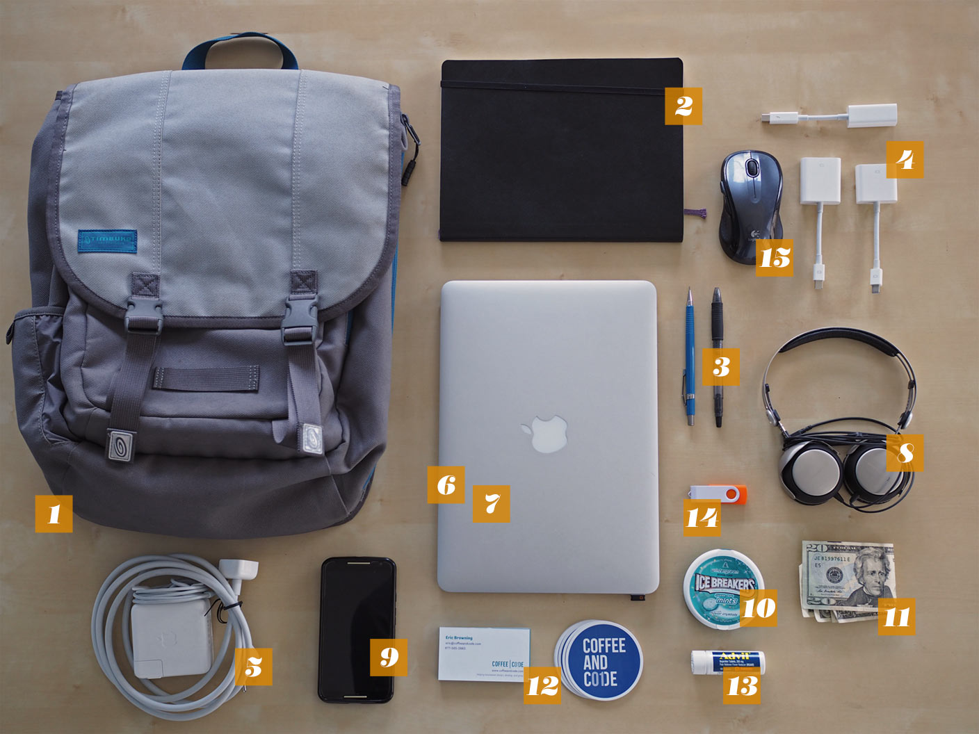
Things you might not think to bring with you, like adapters, cash, mints and swag.

  1. Sturdy bag

    Obviously you need something big enough to fit everything in, but make sure to get something that’s comfortable to walk around with too. You might be shuttling around a big campus or making some unexpected walks out for lunch, etc. A bag with some extra storage compartments helps you look more professional than dumping out everything you’re carrying just to find something at the bottom.

  2. Notebooks/sketchbooks/sticky notes

    From Moleskine to Field Notes, as an industry we love our fancy writing implements. Depending on what your field is, you might want to bring graph paper, pages with mobile device templates printed on them, or kits that make paper prototyping easier. Remember not to assume you’ll have access to your preferred tools when you’re working somewhere new.

  3. Pens & Pencils

    It seems silly but your meeting space or temporary office might not have even basic equipment like this, or you might have to waste a teammember’s time trying to round up supplies.

    If you just leave these in your bag all the time, make sure to check them every once in awhile. Nothing’s worse than a dried up pen or pencil with broken lead when you really need it. You get bonus points if you grab a few extras to share.

  4. Adapters for everything

    A recurring theme is that you never know what the setup is going to be at a new space; bring adapters for every kind of display you can think of…even VGA. You might be pairing with someone, or presenting in a small conference room.

    If you need an adapter for wired ethernet you should snag one of those too; client wifi can be spotty or there might be weird security restrictions you didn’t know about in advance.

  5. Power adapter with giant cord

    Bringing your power adapter is obvious, but if you have the option to bring a longer cord (like Mac laptops) make sure to toss it in. They’re awkward to haul around, but you never know when you need a longer connection, or you have to fit into a crowded power strip.

  6. Public wifi VPN app

    When you’re connecting to a bunch of different wifi networks, having a VPN to route your traffic through is a big step for security. We recommend Cloak on OS X. It kicks in automatically on open wifi networks and works seamlessly to protect you.

  7. Password manager

    We think everyone should be using a password manager like 1Password, but that’s a discussion for another day. The real advantage for working on-site is being able to save specific credentials to a vault, or tagged in some way. This way you can easily access everything related to one client, and if at some point they’re no longer relevant you can remove them cleanly.

  8. Headphones

    Even if you’re going to be spending the day collaborating, headphones are great for video conferences with your team or remote members without disturbing everyone else in the office. They’re also incredibly useful for tuning out ambient noise in an open office environment.

  9. Phone with tethering

    You’re obviously going to bring your phone, but consider making sure you have tethering on your phone/plan. If wifi gets flaky or you’re in an unfamiliar place having a connection you can use can be a lifesaver. You can also score bonus points by saving the day and sharing your connection with your colleagues if things go south.

  10. Mints or tiny mouthwash

    Especially if you’re a coffee person, a little freshening up before meetings can’t hurt. Throwing a travel sized mouthwash can save you from potential embarassment.

  11. Spare cash

    Some spare cash comes in handy at unexpected times. Traveling to a clients’ office takes you on routes you’re not used to; you might have to take a toll road or you might hit up a cash-only lunch spot.

  12. Your swag

    Business cards, stickers: whatever you’ve got don’t forget to bring some along. This goes double if you’re a freelancer or part of a smaller firm; you always need to keep marketing and stay prepared to jump on opportunities that might come up.

  13. Headache relief

    Let’s be honest, most of our jobs are not physically demanding…at all. But, there are still stresses and mental demands. Few things will ruin your day quicker than a headache when you have to stare at screens all day. Remember that any medications you carry will have expiration dates, so you’ll want to check them occasionally.

  14. USB drive

    Services like Dropbox work great, until they don’t. Connection weirdness, bandwidth issues, and syncing problems – sometimes a simple thumb drive can save you a ton of time and frustration.

  15. Input device

    It’s easy to get very accustomed to your usual home or office setup. Little things like not having your mouse or trackpad introduce distractions you don’t want to mess with. One extra caveat here is to check the batteries if they’re not rechargeable – buy a spare set and toss them in your bag too.

The Cleveland Plain Dealer visits our office space.

We were happy to chat with John Harper from the Cleveland Plain dealer and show him around our office. He wrote a great article about OSC TechLab where our office is (we’re the green and white office with client logos on the wall).

It’s nice to see some of our friends get mentioned too; we really believe that an environment filled with other people doing interesting work helps inspire us and keep us motivated.

Recap: Ethan Marcotte – Responsive Design

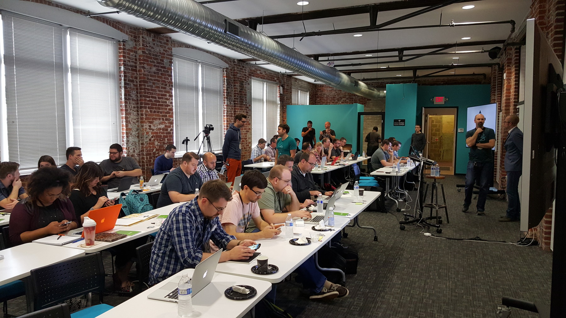
This is a recap of the workshop Ethan Marcotte – Responsive Design given on November 5th, 2015. This workshop was the sixth installment of the Build Right Maker Series given by Sparkbox.

We are no strangers to the awesome workshops that our friends at Sparkbox have curated. As a company, this marks the fourth time that we’ve been to one of their events. If you haven’t heard of or been to an event that they’ve hosted, we recommend looking into them. They make the round trip drive from Akron to Dayton in one day (almost) worth it. We recommend getting a hotel.

One thing that I’d like to give a shout-out to before we begin is the food and drinks! From the awesome pastries and Qdoba burrito bar, to the bartender on the rooftop afterparty, this event was filling!

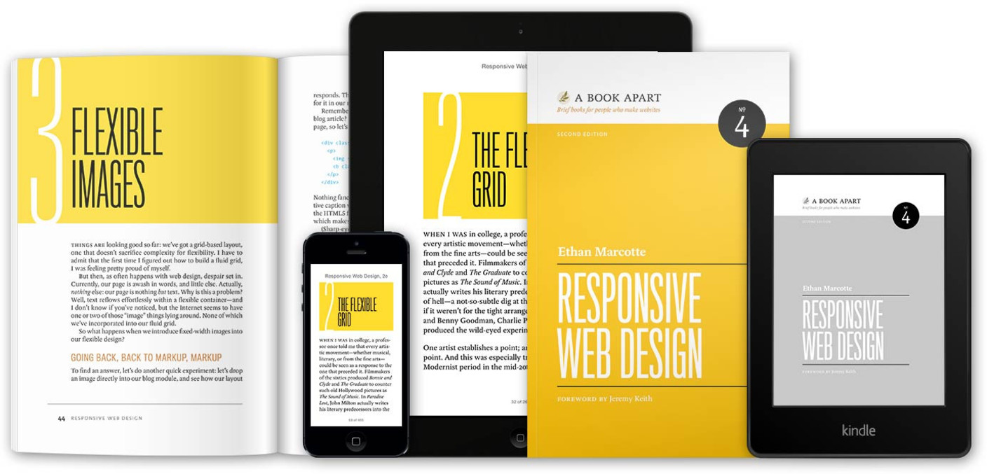
Calories aside, we really enjoyed hearing Ethan speak on his forte. For those of you who don’t know, Ethan Marcotte literally wrote the book on responsive design. A five year old book, it’s still considered required reading for web developers and designers and we have absolutely no problem promoting it.

responsive design book by Ethan Marcotte

We have obviously known of Ethan’s work for some time now, and that was why we were so excited to hear him speak. We wanted to see what he was doing today, and if his thoughts still stood the same regarding responsive design.

To no surprise, he still stands by his three technical ingredients required for responsive design:

  1. Fluid grids
  2. Flexible images
  3. Media queries

Ethan is confident that when combining these three things, a responsive design is easily implemented on the web, and we agree!

You have probably seen flexible grids from technologies such as Bootstrap, and flexible images by adding max-width: 100%; to your img tag styles, but what about media queries? How many of us have truly looked into the capabilities of media queries? Side note: Extra credit for those excited about Element Queries!

For those who are unfamiliar:

The @media rule is used to define different style rules for different media types/devices.

From W3C at w3schools.com

Ethan broke media queries out into two different classes, and we enjoyed the explanations. The first class of media queries are the major queries. These queries define where larger layout changes occur on a web page. The next class, the minor queries, are used to adjust line heights or font sizes as a page size is reduced.


One subject that seems to come up with Ethan a lot is content strategy. An exercise that we did was to take a website, divide it into its content, ignore its layout, and make a single lane priority for it. It’s a very difficult exercise! Could you decide whether a promotion was a higher priority than a logo? What about if a logo was a higher priority than a sign-on form? Very thought provoking!


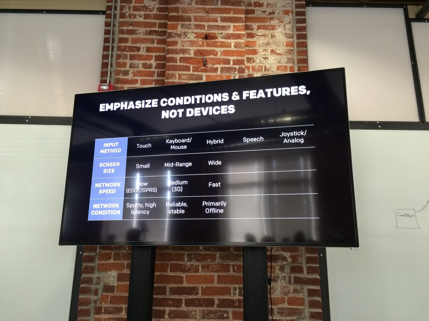
condition and feature grid

Next, we came to the idea of designing not for a device screen, but for an infinite space. Several times we found ourselves asking questions like:

How will this look on a tablet?
or
How would this look on a phone?

When we should really be asking ourselves questions like:

How would this look on a medium sized touch screen with a spotty, high latency connection?

A big take-away that we had was to stop referring to devices as anything more than conditions and features and that using terms such as “tablet” and “mobile” were doing a disservice to our industry.

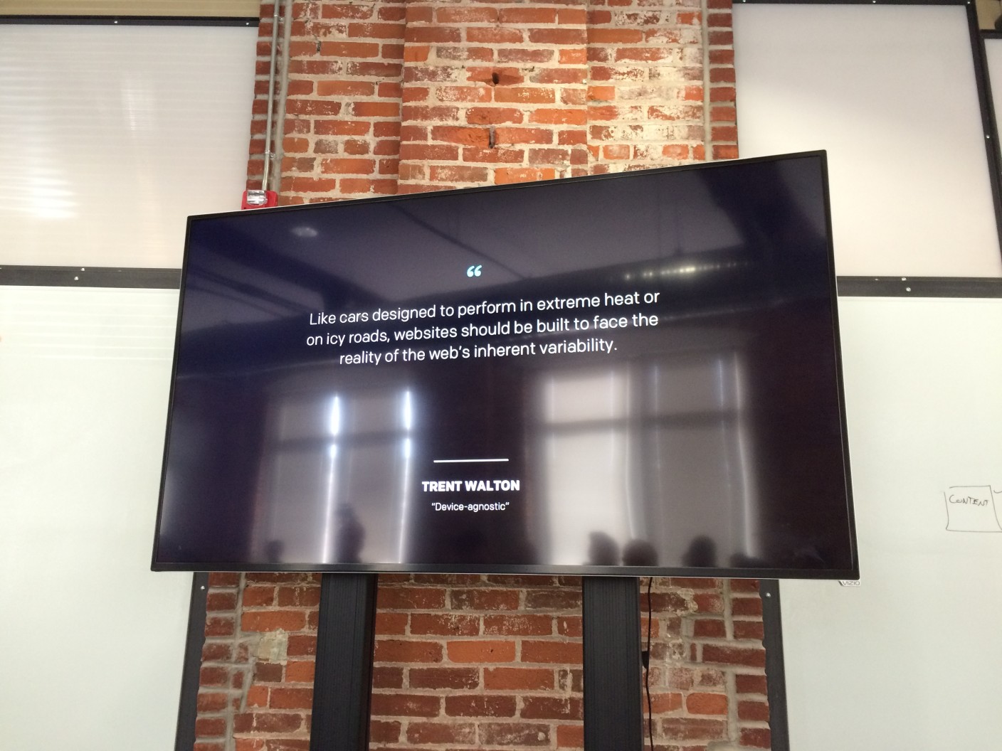
This spiked an awesome conversation regarding the sustainability of your design / code when a network is unstable and causes a resource failure. What if your website never loaded your CSS? This quote was particularly interesting:
reliability quote

Like cars designed to perform in extreme heat or on icy roads, websites should be built to face the reality of the web’s inherent variability

From Trent Walton in his article Device Agnostic</cite

This is a very specific topic that we haven’t been able to stop thinking about. What if a stylesheet never loaded? What does our bare layout look like? What happens when a browser in non-ideal conditions prioritizes our content over our images? Does our site still hold up? Can someone with a sub-par phone view the content that we have put out? Do they have a (relatively) similar experience as another person on a large screen with mouse on a fast and reliable connection? If not, why?

Hopefully this can spark some thought with you, and you can start to ask these questions about your own designs or code.


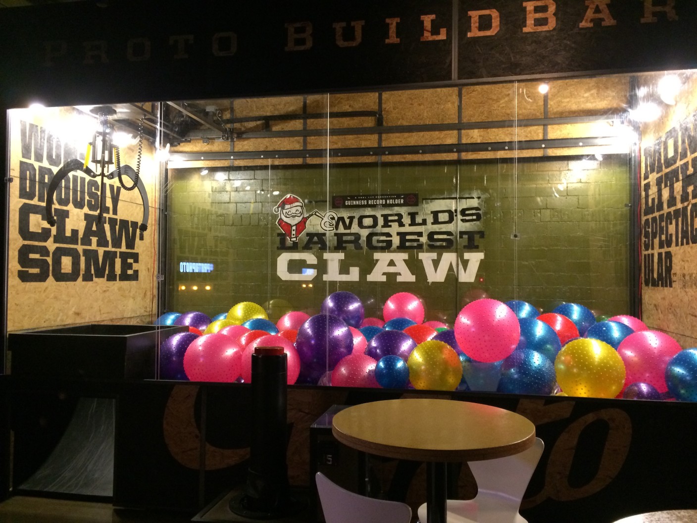
Yet another side note: Sparkbox is located a block away from an awesome place called Proto Build Bar. They have the world’s largest claw machine. We don’t want to hold any judgement, but Eric’s z-axis perception needs some work. He’s the only one of us that didn’t go home with an inflatable ball:

claw machine