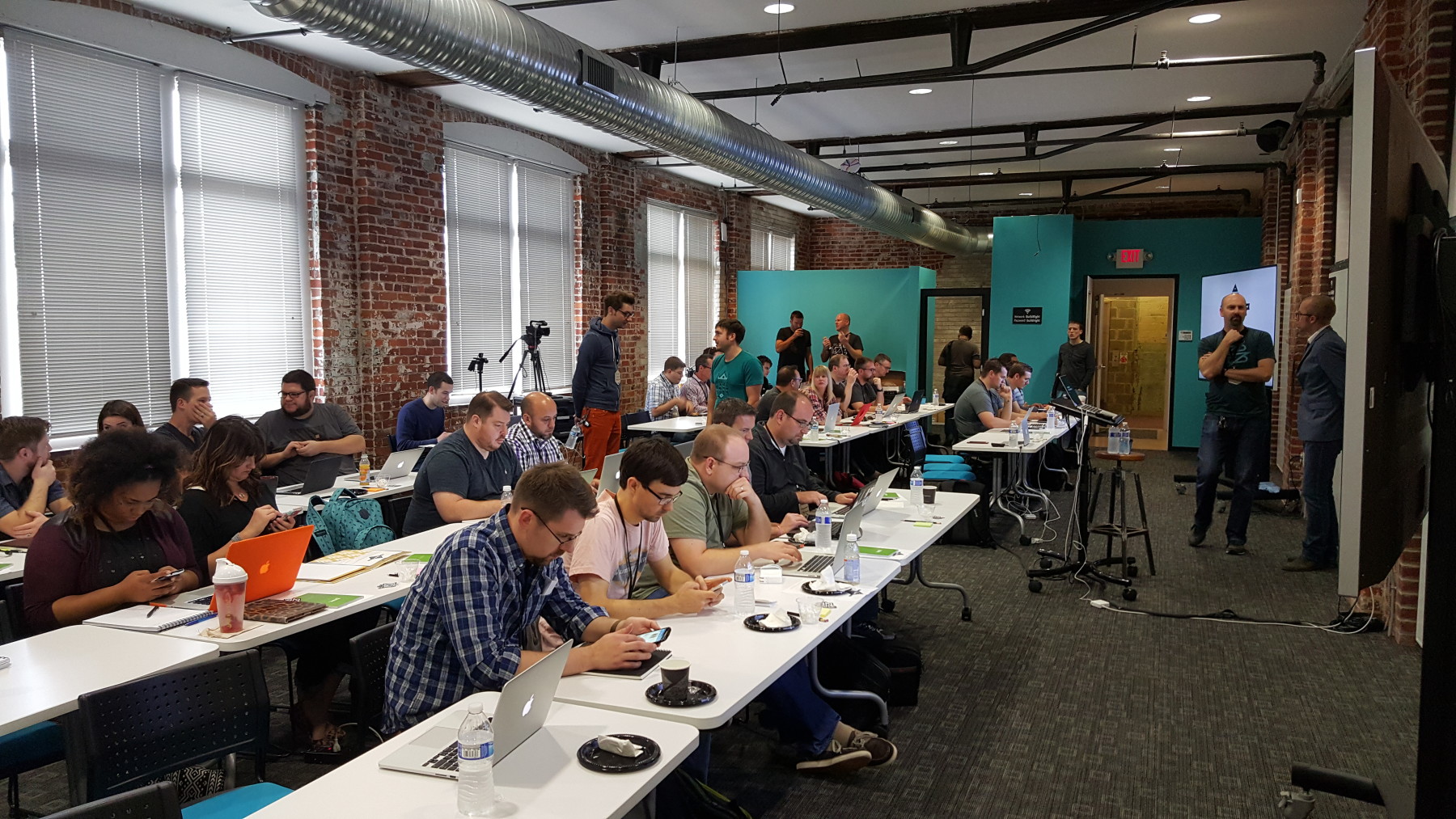
This is a recap of the workshop Ethan Marcotte – Responsive Design given on November 5th, 2015. This workshop was the sixth installment of the Build Right Maker Series given by Sparkbox.
We are no strangers to the awesome workshops that our friends at Sparkbox have curated. As a company, this marks the fourth time that we’ve been to one of their events. If you haven’t heard of or been to an event that they’ve hosted, we recommend looking into them. They make the round trip drive from Akron to Dayton in one day (almost) worth it. We recommend getting a hotel.
One thing that I’d like to give a shout-out to before we begin is the food and drinks! From the awesome pastries and Qdoba burrito bar, to the bartender on the rooftop afterparty, this event was filling!
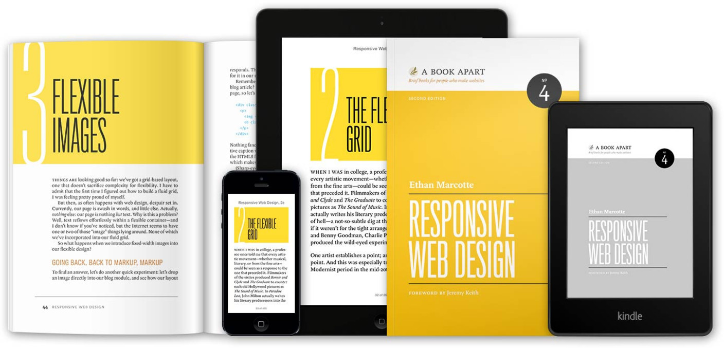
Calories aside, we really enjoyed hearing Ethan speak on his forte. For those of you who don’t know, Ethan Marcotte literally wrote the book on responsive design. A five year old book, it’s still considered required reading for web developers and designers and we have absolutely no problem promoting it.
We have obviously known of Ethan’s work for some time now, and that was why we were so excited to hear him speak. We wanted to see what he was doing today, and if his thoughts still stood the same regarding responsive design.
To no surprise, he still stands by his three technical ingredients required for responsive design:
- Fluid grids
- Flexible images
- Media queries
Ethan is confident that when combining these three things, a responsive design is easily implemented on the web, and we agree!
You have probably seen flexible grids from technologies such as Bootstrap, and flexible images by adding max-width: 100%; to your img tag styles, but what about media queries? How many of us have truly looked into the capabilities of media queries? Side note: Extra credit for those excited about Element Queries!
For those who are unfamiliar:
The @media rule is used to define different style rules for different media types/devices.
From W3C at w3schools.com
Ethan broke media queries out into two different classes, and we enjoyed the explanations. The first class of media queries are the major queries. These queries define where larger layout changes occur on a web page. The next class, the minor queries, are used to adjust line heights or font sizes as a page size is reduced.
One subject that seems to come up with Ethan a lot is content strategy. An exercise that we did was to take a website, divide it into its content, ignore its layout, and make a single lane priority for it. It’s a very difficult exercise! Could you decide whether a promotion was a higher priority than a logo? What about if a logo was a higher priority than a sign-on form? Very thought provoking!
Next, we came to the idea of designing not for a device screen, but for an infinite space. Several times we found ourselves asking questions like:
“How will this look on a tablet?”
or
“How would this look on a phone?“
When we should really be asking ourselves questions like:
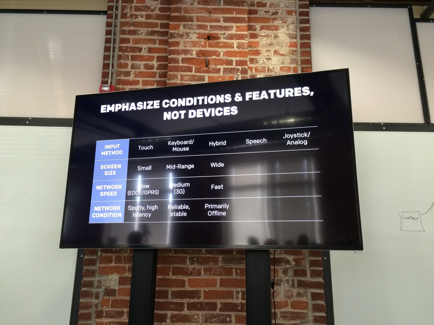
“How would this look on a medium sized touch screen with a spotty, high latency connection?“
A big take-away that we had was to stop referring to devices as anything more than conditions and features and that using terms such as “tablet” and “mobile” were doing a disservice to our industry.
This spiked an awesome conversation regarding the sustainability of your design / code when a network is unstable and causes a resource failure. What if your website never loaded your CSS? This quote was particularly interesting:
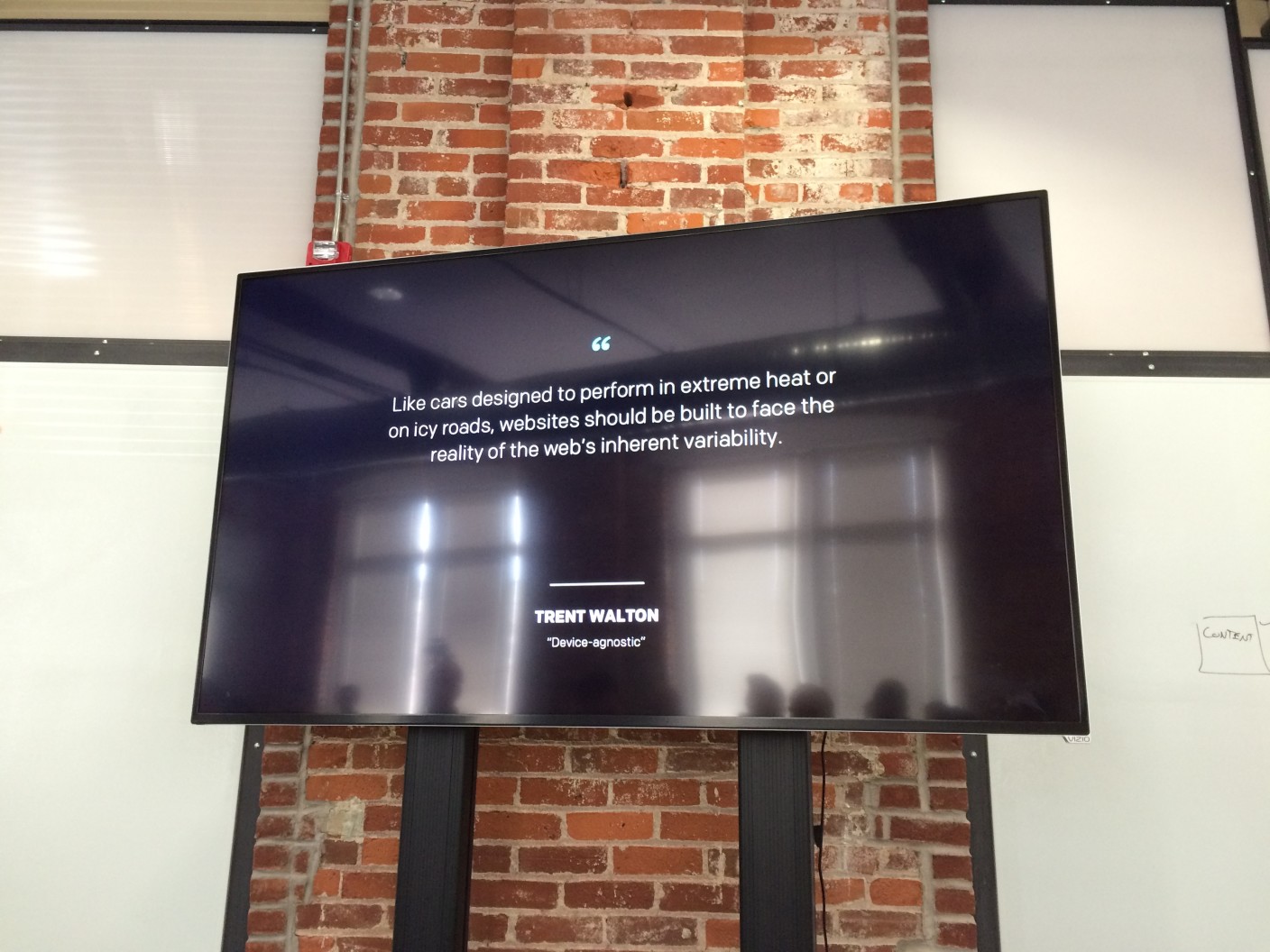
Like cars designed to perform in extreme heat or on icy roads, websites should be built to face the reality of the web’s inherent variability
From Trent Walton in his article Device Agnostic</cite
This is a very specific topic that we haven’t been able to stop thinking about. What if a stylesheet never loaded? What does our bare layout look like? What happens when a browser in non-ideal conditions prioritizes our content over our images? Does our site still hold up? Can someone with a sub-par phone view the content that we have put out? Do they have a (relatively) similar experience as another person on a large screen with mouse on a fast and reliable connection? If not, why?
Hopefully this can spark some thought with you, and you can start to ask these questions about your own designs or code.
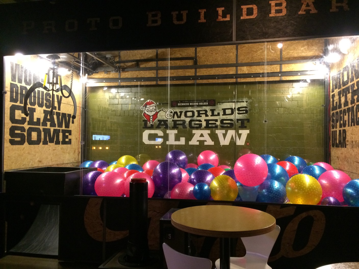
Yet another side note: Sparkbox is located a block away from an awesome place called Proto Build Bar. They have the world’s largest claw machine. We don’t want to hold any judgement, but Eric’s z-axis perception needs some work. He’s the only one of us that didn’t go home with an inflatable ball: