Hack N Akron 2.0: A Continued Story of Community Involvement

On Saturday, April 22nd 2017, the second iteration of a hackathon series called “Hack N Akron” took place at White Space Creative. The goal of the event was to use community volunteer time to build creative solutions for civic problems that the organizing team, myself included, discussed with the city prior to the event.

This is a 12 hour event that starts at 7:30am with a public opening ceremony at 8:30am that included speeches from:

Hack N
Group photo of the Hack N Akron opening ceremony. Photo Credit: Meghan Goetz

After the opening ceremony, volunteers quickly disperse to meet up with their project managers so they can be briefed on their project background, figure out what their deliverables look like, and start working on tasks.

Teams working during the hackathon
Focusing on skills-based volunteering, your role will match what you’re best at. Above we have Mori and Roger working on long term strategy while the rest of the team builds today’s application in tandem.

I’ve had a number of meetings directly with the mayor and his staff to figure out what sustainability looks like for these projects. The city of Akron has been incredibly open and willing to set aside some of their budget and effort to actually begin using a lot of the solutions that are being created from scratch at our hackathons, and even donated their time and infrastructure to host and maintain the more technical solutions. More was done during the hackathon, but the technical solutions that we were involved in include:

  • An Open Data API that allows software developers to gain access to city economic development data. This allows them to search and parse data as they see fit, coming up with trends, patterns, and correlations the city may not have thought of previously.
  • A “City Health” dashboard that gives non-technical users a visual look into charts and graphs that show the economic development data we were able to put into our API.
  • An application that allows a user to search for land based on its current use.

We’re always excited to be a part of events like this. In fact, we had all three of us involved in one way or another:

  • Jon Knapp: Team leader and participant of the Open Data API team.
    Open Data API Team
  • Eric Browning: Team leader and participant of the Open Data Dashboard team.
    Open Data Dashboard Team
  • Byron Delpinal: Co-organizer of Hack N Akron and project manager for the Open Data Innovation team. (Not pictured because someone had to take the photo!)
    Open Data Innovation Team

At the end of the day, participants have the ability to get about 10 hours of work in. With a volunteer attendance of around 50, this is approximately 500 service-hours of time. This equates to $11,495* of value in one day that is donated by local professionals to help better our city in one way or another, and does not take into account the countless planning meetings, sponsorship dollars, and space donations given for the event.

In short, we were happy to be a part of such a great event!

*Volunteer value calculated using the Independent Sector Volunteer Time Value.

2016: A Year In Review

When a new year begins, we always take some time to set our own (usually unrealistic) goals for ourselves both personally and together as a company. This helps us stay focused and dedicated throughout the year. As the year comes to a close we found ourselves reflecting on what this year meant for us. We are incredibly thankful for our clients and for our friends for supporting us throughout this year. We’d like to take a bit to recap our year, and give some insight into what the next year will bring for us.

What went right?

After taking the plunge to moving the company from a single person to a lean, three person team, this year was our most successful to date (and we’re really proud of that). The way we measure that success is by seeing how many things from the past year we can put into our “things we care about most” buckets which are:

  1. Client Wins
  2. Personal Wins
  3. Speaking Engagements
  4. Event / Organization Sponsorships

Client Wins

Our clients success is our success, and we’re deftly intent on seeing them succeed. Here are some awesome wins they had in 2016:

Owner of CrowdfundInsider launches platform to search and promote SEC filings

We worked with the owner of the leading news and information website covering disruptive finance to improve the process that users go through to access SEC filings. This service, Disclosure Quest, allows users to see an “at a glance” view of crowdfunding filings but more importantly, allows them to dig deeper and view the actual documents and assets that were filed with an easy to use search interface.

The AIM Institute launches a service to test new markets for product development

AIM is a long-time client of ours who we have had an ongoing feature and maintenance contract with. They’re an absolute pleasure to work with. This year we were able to bring to fruition an amazing idea they had, B2B MarketView, which gives businesses the ability to answer a few questions to receive an insightful, custom built report regarding the market position of potential new products.

iDisclose and Disclosure Quest launch Form C support

May 15th, 2016 was a big day in the crowdfunding industry. It was the first day that one could file the newly available “Form C” document, allowing individual people to invest in one’s company in exchange for equity. We can proudly say that the first Form C document that was filed, at 6:35am that day, was a document created by iDisclose, a client whose web based application we developed in 2015.

Soon after submission, someone could find the filing information on Disclosure Quest, another of our client’s projects. Having support for Form C from day one was massively important for our clients, a need that we can say confidently that was met.

vLoan launches newly realigned homepage and expanded online mortgage service

We worked with vLoan on a number of pieces to their online mortgage system, but this year we were given the ability to take a fresh look at their homepage which was originally built for their MVP launch. We had a year of data and customer experiences which were used to target the messaging and layout for conversion. In doing so, we were also able to make improvements to design, performance, and page accessibility; three things we care a lot about as a company.

Peak Telematics launches Darby, a usage based insurance application

Working directly with Brad Colbow, a local UX and design guru, we designed and built the templates for the company’s web application which takes an ultra modern approach to an industry not known for putting an importance on usability and design. In 2016 they released an alpha version of their application which they intend to license to insurance companies.

A magazine with more than 500,000 monthly page views gets complete website redesign

Working with our friends at Studio Mercury we had the distinct pleasure of implementing, from the ground up, the new website design they created for one of their clients. There was a lot of custom functionality developed to help meet the new, modern demands of their site’s users. The website is slated for launch in early 2017.


Personal Wins

We believe that it’s very important to grow as a person outside of the business. We try to give back and involve ourselves in causes that we care deeply about in our communities.

Byron was accepted into the 2017 class of Akron Torchbearers, a Leadership Akron independent affiliate

One of our developers, Byron, was accepted into the 2017 class of Torchbearers. This program is equally focused on leadership development and community service and has well over double the amount of applicants as it does accepted members. The organization exists to strengthen the connection between Akron-area nonprofits and emerging leaders.

Company sponsors, helps organize, and attends Cleveland GiveCamp

Cleveland GiveCamp, one of the nations largest GiveCamps with over 200 volunteers annually, has been a passion of Jon Knapp since its inception 8 years ago. As Coffee and Code grows, so does its involvement in the organization. More on this can be read in a previous write-up here.

Company helps organize and attends Hack N Akron, a civic hackathon

Hack N Akron, a civic hacking group, was founded by a group of local volunteers including our developer, Byron. He helped not only plan the technical direction for the day, but connected the city staff to the development team, and worked hard to make the event a success. Eric also attended the event and helped with design guidance and research questions.

Akron Front End Development Group

Byron has been the sole organizer of a technical meetup group in the Akron area that he started as a Micrommunity of Launch League in May of 2016. The group has hosted monthly meetups and several hack nights to create a community of local developers and designers interested in leveling up and expanding their skill set.


Speaking Engagements

We believe that public speaking, especially at conferences and meetups relating to your field, is one of the best ways to grow as a person, and as a professional. The confidence, required research, and people skills developed while doing this are invaluable.

Design Feedback for Everyone, Eric Browning

Eric’s talk, Design Feedback for Everyone, was a big hit this year. On discussing how non-designers and designers can interact more efficiently, Eric gave this talk at three different events. First at StirTrek, then at the Columbus Web Group, and lastly at Flight.

Personas: an Interactive User Experience Workshop, Eric Browning

Eric crafted an interactive workshop to help work out different personas given a particular group, organization, etc. He gave this workshop at the UX Akron meetup group and an event organized by Akron Women in Tech.

Docker on the Docks, Jon Knapp

Speaking to the Cleveland Ruby Brigade (CleRB) Group, Jon talked through the process of creating and setting up Docker containers, how they differ from VMs, and lessons learned bringing local development and deployments to the technology.

Building “Serverless” Software with AWS Lambda, Jon Knapp

After utilizing AWS Lambda for a few interesting projects at the company, Jon put together a talk on the subject which he gave at Erie Day of Code, Pittsburgh Tech Fest, and will be delivering it in January of 2017 at CodeMash.

Wadsworth Career Day, Jon Knapp

For the third year in a row, Jon talked to Wadsworth high school students at their annual Career Day. He spoke a bit on starting a business, his personal development path post high school, info about the job market, and focused on open Q&A with the students.

How HTTP/2 Fits Into Your Workflow, Byron Delpinal

For a while now, Byron has been interested in web performance. He gave this talk outlining the benefits of HTTP/2 and how to implement it at Flight and will be giving it again in early January 2017 at Codemash.


Event / Organization Sponsorships

We believe in supporting things that we want to see more of. It’s a big deal to us, especially in our local community. Here are the events and organizations that we supported in 2016:


Looking Forward to 2017

2016 was great, but what happens next? We’re looking to do more of what we love and are interested in finding:

  1. Awesome clients to bring on board in the new year.
  2. Great people to work with in developer, marketing/sales, and business development roles.
  3. Opportunities to speak at industry events.

If you’re interested in bringing any of these to our attention, don’t hesitate, we’d love to hear from you! You can contact us at info@coffeeandcode.com.

Responsive Graphing and Charting Using HTML5 Canvas

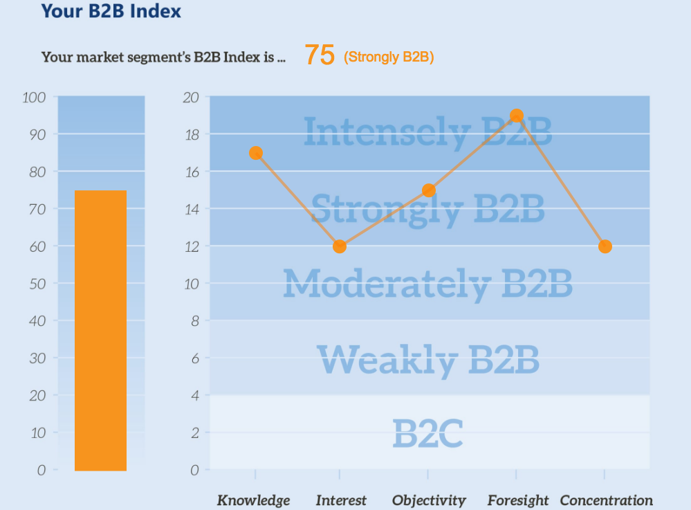
Recently we were tasked with creating a dynamic chart and graph for a client who is in the B2B Coaching space. They wanted this chart in a dynamically created PDF as well as in their responsive web application. In this post, we’ll talk about how we solved this problem in their responsive web application using zero Javascript dependancies for an added performance win.

Finished Product

You can view all of the code related to this post on Codepen with this link.

See the Pen Responsive Charting and Graphing with the HTML5 Canvas Element by Byron Delpinal (@coffeeandcode) on CodePen.

Client Application: https://b2bmarketview.theaiminstitute.com/

Fair Warning: This post is going to be dry and code-heavy, but there’s some pretty cool stuff in there if you can stick with me.

Technical Requirements

  1. We will use an image for any static content with-in the charted area.
  2. The dynamic content will be generated by vanilla Javascript to mitigate the need for bringing in any external libraries.
  3. All measurements when drawing will be percent-based to keep the drawing responsive.
  4. The dynamic content will be stored as data- attributes on the canvas element.

Markup

We want to be as minimal as possible here. The bare-bones of what we need are an image, a container to hold that image that will resize to be the exact size of the image, and a placeholder for the canvas drawing.

<div class="b2b-graph-container">
  <img alt="B2b index graph" class="b2b-graph" src="/pathtoyourimage/image.png"/>
  <canvas data-aggregate="58" data-knowledge="14" data-interest="7" data-objectivity="6" data-foresight="11" data-concentration="20" id="graph-canvas"></canvas>
</div>

Javascript

There is a lot of Javascript required to make this work. I tried my best to keep things modular and abstract things when it made sense. Hopefully this will make this a bit easier to digest.

The initial JSON objects used to store the known values of the bar graph and each line graph point:

var barGraphElement = {
    maxAmount: 100,
    scoreAttribute: 'data-aggregate',
    width: 7.5,
    xCoord: 10.8,
    yScale: 10
  },
  lineGraphElementList = [{
    maxAmount: 20,
    scoreAttribute: 'data-knowledge',
    width: 1.25,
    xCoord: 37,
    yCoord: 0,
    yScale: 2
  }, {
  // All other points on the line graph
  ...
  }];

When our page is loaded, our application.js file runs conditional code to see if we need to draw our graph on this page or not. That looks like this:

var canvasElement = document.querySelector('#graph-canvas'),
    graphElement = document.querySelector('.b2b-graph-container');

if (canvasElement && graphElement) {
  drawGraph(window, graphElement, canvasElement);
}

This separates our concerns a bit having the application logic finding the required elements and passing them into our actual drawGraph function. Our drawGraph doesn’t necessarily care about what the elements are, or what context is used, it only knows about drawing the graph.

When we know that we should be drawing our graph on this page, we need to wait for our image to load before doing anything else. There’s a .complete method for images that can be used like this:

var imgElement = container.querySelector("img");

if (imgElement.complete) {
  // The image is already loaded!
  initializeDrawing()
} else {
  // The image is not loaded, let's attach an event handler to it
  imgElement.addEventListener('load', initializeDrawing, false);
}

Our initializeDrawing function handles the main logic flow, here it is, I’ll break it down below:

var initializeDrawing = function     initializeDrawing() {
  var context = canvas.getContext('2d');

  resizeAndPositionCanvas(canvas);
  updateContainerOffsets();

  // Set the stroke color
  context.fillStyle = '#ed1c24';
  context.strokeStyle = 'rgba(255,0,0,0.5)';

  // Draw the overall score
  drawOverallScore(context);

  // Draw the bar graph
  drawBarGraph(context);

  // Draw the line graph
  for (var i = 0, l = lineGraphElementList.length; i < l; i++) {
    var currentItem = lineGraphElementList[i],
      previousItem = lineGraphElementList[i-1];

    // Draw the current point on the graph
    drawLineGraphPoint(context, currentItem);
    // Draw a line from the current point to the previous point
    drawLineGraphLine(context, currentItem, previousItem);
  }

  global.addEventListener('resize', resize, false);
}

The first thing that we do is grab the 2D canvas context that we will pass around and use to draw everything we need to on the canvas element.

Next we’ll need to position the canvas directly on top of the image, so the resizeAndPositionCanvas() function takes the canvas element and manually sizes it to be 100% of the parent container of the image.

After that, we call the updateContainerOffsets() function that updates the canvasContainerOffsets object that we’ll be using later on.

After we’ve changed our drawing colors to red, it’s time to start putting some things on our graph! To do this responsively, there’s one key concept that we need to understand: Everything must be measured in a percent based on the parent container.

Diving right into the drawOverallScore() function, we see this:

var drawOverallScore = function drawOverallScore(context) {
  context.font = getPixelWidthFromPercent(4) + "px Arial";
       context.fillText(canvas.getAttribute(barGraphElement.scoreAttribute),
  getPixelWidthFromPercent(44),
  getPixelHeightFromPercent(15.5));
  };

It’s pretty straight forward, we’re just using the fillText function to put the text on the page. The weirdness comes from converting our percentages into pixels, which we’ve abstracted away into the getPixelWidthFromPercent() and getPixelHeightFromPercent() functions. Here they are:

var getPixelHeightFromPercent = function getPixelHeightFromPercent(percent) {
  return canvasContainerOffsets.height * (percent/100)
};

var getPixelWidthFromPercent = function getPixelWidthFromPercent(percent) {
  return canvasContainerOffsets.width * (percent/100)
};

Remember talking about seeing the canvasContainerOffsets object again later? Here it is. Anytime the screen is resized, we recalculate the width and height of the parent container so we can use them at anytime to convert percentages to pixels quickly. That code looks like this:

// Add the event listener
global.addEventListener('resize', resize, false);

// Handle the callback
var resize = function resize(event) {
  updateContainerOffsets();
};

// Update the offsets
var updateContainerOffsets = function updateContainerOffsets() {
  var parentElement = container;

  canvasContainerOffsets = {
    height: parentElement.offsetHeight,
    width: parentElement.offsetWidth
  };
}

Now, we can draw the bar graph:

var drawBarGraph = function drawBarGraph(context) {
  var currentItemScore = canvas.getAttribute(barGraphElement.scoreAttribute);

  context.beginPath();

  var distanceFromTop = calculateDistance(barGraphElement.maxAmount-currentItemScore, barGraphElement.yScale);
  var barHeight = calculateDistance(currentItemScore, barGraphElement.yScale);

  context.rect(getPixelWidthFromPercent(barGraphElement.xCoord),  getPixelHeightFromPercent(universalDistanceFromTop + distanceFromTop),
    getPixelWidthFromPercent(barGraphElement.width),
    getPixelHeightFromPercent(barHeight));

  context.fill();
};

var calculateDistance = function calculateDistance(score, scale) {
  var distanceBetweenEachMarker = 6.2;

  return (score / scale) * distanceBetweenEachMarker;
};

Admittedly, that context.rect() call is a bit weird, so I’ll dissect it a bit. If you check out the canvas rect documentation you’ll see that the parameters are .rect(x, y, width, height) – so we’re defining the x and y starting points, and then the width and height from there. Recall that our barGraphElement has maxAmount, width, xCoord, and yScale properties on it. These, along with the scoreAttribute from our data- attributes will be what we need to complete our goal here. The width is a set percentage, as is the xCoord.

Because of the nature of the .rect() method we will start from the top of the shape and define it from there, this means that we must figure out where the top of a dynamically sized shape. This may seem odd at first, but because we have a background image with horizontal markers on it, the problem isn’t too difficult. It work out to something like this:

((maxAmount - currentScore) / (maxAmount / numberOfMarkers) * distanceBetweenEachMarker) + universalDistanceFromTop

(maxAmount - currentScore) – This gives us the amount of distance from the top of where the bar graph will be, to the top of the bar graphs maximum amount. If our score was 60, we know that it’s 40 from the top. We have to then divide that by the scale. The scale is calculated by seeing how many markers we have (10) and dividing that by the maximum score (100) – in this case, our scale is 10. After we have that, we multiply it all by the distance between each marker to get the final distance as a percentage between the top of the bar graph and the top of the maximum bar graph. Finally, we add the distance from the top of the bar graph to the top of the page. At this point, we know where the top left corner of our bar graph will be, as a percent based on our full image. This is all handled in the above drawBarGraph() and calculateDistance() functions.

As it turns out, we can apply that same logic to draw all of the other things that we need to on our graph. The only two things remaining are the line graph points of intersection, and the lines themselves.

We see above in the initializeDrawing() function that we are looping through each point and using the current item to draw the point, and the current + previous point to draw the line. Here are those functions:

var drawLineGraphPoint = function drawLineGraphPoint(context, currentItem) {
    var currentItemScore = canvas.getAttribute(currentItem.scoreAttribute);
    // We  inverted the coordinates by subtracting it from the maximum since (0,0) is in the top left of the coordinate plane:
    var distanceFromTop = calculateDistance(currentItem.maxAmount-currentItemScore, currentItem.yScale);
    //Since the y distance is only the distance from the top of the plane to the value, we account for the  top buffer of space as well:
    currentItem.yCoord = universalDistanceFromTop + distanceFromTop;

    context.beginPath();

    context.arc(getPixelWidthFromPercent(currentItem.xCoord),
    getPixelHeightFromPercent(currentItem.yCoord),
    getPixelWidthFromPercent(currentItem.width),
      (Math.PI/180)*0,
      (Math.PI/180)*360,
      false);

    context.fill();
};

var drawLineGraphLine = function drawLineGraphLine(context, currentItem, previousItem) {
  if (!previousItem) {
    return;
  }

  context.beginPath();
  context.lineWidth = 4;

  context.moveTo(getPixelWidthFromPercent(previousItem.xCoord), getPixelHeightFromPercent(previousItem.yCoord));
  context.lineTo(getPixelWidthFromPercent(currentItem.xCoord), getPixelHeightFromPercent(currentItem.yCoord));

  context.stroke();
};

So now, we’ve drawn our score onto our graph, our bar graph, and our line graph. Presto, they now work on all screen sizes, using no external Javascript dependencies. Performance win, responsive win, all around win.

If you’d like to learn more about how responsive and performance based approaches can build better web software, we’d love to talk. Please visit us at www.coffeeandcode.com.

2016 Cleveland GiveCamp Recap

Waking up the Monday after GiveCamp is always the most relaxing morning of the year. It’s juxtaposed with the two preceding days where sleep is hard to come by and each morning you are reminded of all of the work that needs to get done that day.

What is GiveCamp?

Cleveland GiveCamp is an incredibly well-organized event that takes place in Cleveland, OH every year that benefits non-profit organizations in the area. The basic flow of events is this:

  1. A local non-profit needs a problem solved through technology but does not have the personal or financial means to solve it themselves.
  2. They apply to GiveCamp to have volunteers solve said problem for them.
  3. After a very long weekend, they leave GiveCamp with a (hopefully) working and maintainable solution to their problem.

Every year the event has ~200 volunteers who handle everything from design, development, implementation, and copy writing, to food, setup, and cleanup.

The event is a time where you can meet like-minded people, make meaningful connections with others, and do some good in the world.

What did Coffee and Code do?

We proudly play many roles in helping GiveCamp become the successful event that it is today. Did I mention that it’s the nations largest and most well-sponsored GiveCamp event?

1. Sponsor

GiveCamp Water Bottles

Photo by Stuart O. Smith, Jr. @sos_jr

We were more than happy to become one of the many sponsors of this event, helping to ensure that it had the funds it needed to make sure every team had the supplies they need to succeed.

2. Organizer & Fire Extinguisher

GiveCamp Team Y Group Photo

Photo by GiveCamp photographers

Jon Knapp, founder of Coffee and Code, is a recurring organizer for GiveCamp as well as a member of Team Y. Call them all-stars, fire extinguishers, or red-shirts, Team Y was the group that you called when something went wrong. They are seasoned members of the community that are veterans in flipping a train wreck into a smooth delivery.

3. Volunteer

GiveCamp Team M Group Photo

Photo by GiveCamp photographers

Byron Delpinal, developer at Coffee and Code, is a second-year volunteer and member of Team M. His team helped the Northeast Ohio Voters Advocates better show their goals to a wider audience through a newly branded and designed website. This allows them to showcase who they are to a wider group of people. They now have a mobile-friendly site and can even take donations online!

What’s the weekend like?

A weekend at GiveCamp takes roughly 400 hours to complete in the minds of those that attend. In reality, it’s a 72-hour weekend.

Day One: Plan and Begin

Site Map and Priority List
Volunteers arrive and check-in Friday around 5PM where they are assigned a team. Each team is a single letter. At this point, the volunteer doesn’t know which non-profit they’re working with, or who their other team members are. There is a 30min opening ceremony , and then its off to dinner. Oh my gosh, dinner. The food at GiveCamp is so top-notch, seriously. I can’t say enough about it. At dinner, you are assigned an eating / working area where you finally meet your team and non-profit all at once. This is a meet and greet where you get to find out what work you’ll be completing and who you’ll be completing it with.

After dinner, the project manager starts assigning tasks and it’s off to the races! Teams work hard to start gathering the resources they need and syncing up development environments. Day one usually starts winding down after the last stand-up at 11PM, but teams can be seen working on the boat until very early in the morning. At the end of this day, you should have mapped out what this project looks like and how you’re planning to tackle this.

Day Two: Collaborate and Work

Task List on Post It Notes

Photo by Anna Kiss Mauser-Martinez

On Saturday, breakfast is served at 7:30AM. Teams eat and begin working around 8. At this point, the team usually has a fairly good understanding of the direction of the project as well as what each members role in that will look like. Task lists are created and teams go to work on their collaborative solution.

Depending on how large your project is, Saturday can become anywhere from a 12 to a 20 hour work day. This is where the real magic of GiveCamp happens, and most of the work is done. The organizers of this event do an amazing job of making sure that whatever it is that keeps you going is there to support you. Whether you work best on low-carb energy bars, fruit, coffee, donuts, cupcakes, or chips, there are snacks and drinks available 24/7. The planned meals, again, are on a league of their own.

Day Three: Finish up and Present

Waking up Sunday is a very different experience for everyone. Some projects have been finished and are writing documentation for their non-profits while others have three members from Team Y in their work space. No matter where you are on that spectrum, don’t panic. Sometimes things happen that aren’t ideal and that’s ok, remember that everyone is there to help. This year there was a 100% project success rate, which only happens when you truly have a community that is focused on helping others. Egos are put aside, frustrations are calmed, and everyone does whatever is necessary to get the projects completed.

Closing ceremonies are at 4PM where each project is presented to the group. This is when you can finally relax your mind and enjoy the fact that no matter which project you were on, you helped someone that needed it. Regardless of your stress level throughout the weekend, you leave with a big smile and a feeling of satisfaction.

Prioritizing Performance: Completing a performance audit using Web Page Test

Optimizing a website for performance is hard, but that’s what makes it fun! When you plan to accomplish a goal, it’s never a good idea to go from 0 to 100 immediately. Whether it’s running a marathon, getting out of debt, or learning to wake up early in the morning – you have to take things one step at a time. This applies to improving performance as much as it does to these other examples.

The first step to improving your site’s performance is to establish a baseline of where it is at today. What we’ll need to do is a performance audit. This is an in-depth, instantaneous look at the performance of a website.

Enter Web Page Test

Web Page Test provides you with a very detailed view of what’s happening on your website. Here are a couple key metrics that you need to pull out and begin to document:

  1. Load Time (Document Complete Time)
  2. Time to First Byte *
  3. Start Render
  4. Speed Index **
  5. Fully Loaded Time

These are the high level items that you’ll want to be able to reference, but for this audit we’ll go a bit more in-depth to see what’s really going on behind the scenes. To do so, we’ll need to track data from each call that is made from the site. From each call, we’ll want to know:

  1. Mime Type
  2. URL
  3. Size (KB)
  4. Request Start Time
  5. DNS Lookup Time
  6. Initial connection time
  7. Time to First Byte
  8. Content Download Time
  9. Total Time Taken

Once you’ve arranged all of this data in a spreadsheet I’m sure your first question is something like this:

What does all of this data mean!?

You, probaby

With this information we’ll be able to pinpoint exact situations where we can improve, we just need to know what to look for. Let’s look at a quick example to outline a scenario that we should be looking for:

SVG Chart Example

Here we can see that we’re loading in 5 SVG images. These images take a total of 597ms to perform a DNS lookup, establish a connection, and wait for a first byte. That means that half a second went by, and we haven’t even started to download these images! Granted, some of these things could be happening synchronously, but we can all agree that it’s a bit of a waste for five images that take 0ms to actually load because of their small size. An easy improvement to this is to create a sprite sheet, reducing all of the inherent network latency involved in calling a server five times over again into one call.

For those unfamiliar:

[Sprite Sheets] are important for website optimization because they combine several images into one image file to reduce HTTP requests.

From Guil Hernandez at the Team Treehouse Blog

Please keep in mind that the sprite sheet optimization technique (hack?) is for a website following the HTTP 1.x protocol. This is considered an anti-pattern in the newer HTTP2 protocol. You can read about the HTTP2 protocol here. For a more concise translation regarding the switch from HTTP1.x to HTTP2 check out this post by Matt Wilcox

This scenario should hopefully give you an insight into what we’re looking for as we sift through this data. Every site and scenario will be unique, so I’ll let you dissect away!

When all is said and done, you should be able to get some valuable data by aggregating the call times by sections. Ours came out looking like this (Y-Axis is time in milliseconds):
Performance Graph

Are you noticing a lot of initial connection and time to first byte time, but not a lot of content download time? It seems like you might want to try combining some assets to make less HTTP requests! Are you seeing high content download times? You might want to try compressing your assets to decrease their size to a more reasonable level!

Hopefully with this information you’re ready to audit your own website and begin prioritizing performance!


* If you’re using a CDN like CloudFlare and Gzipping your files, you shouldn’t be worrying about the Time To First Byte metric as stated in this post by Cloudflare themselves.

** The math behind a Speed Index Score is very interesting, and best described in this page in the Web Page Test documentation.

Recap: Ethan Marcotte – Responsive Design

This is a recap of the workshop Ethan Marcotte – Responsive Design given on November 5th, 2015. This workshop was the sixth installment of the Build Right Maker Series given by Sparkbox.

We are no strangers to the awesome workshops that our friends at Sparkbox have curated. As a company, this marks the fourth time that we’ve been to one of their events. If you haven’t heard of or been to an event that they’ve hosted, we recommend looking into them. They make the round trip drive from Akron to Dayton in one day (almost) worth it. We recommend getting a hotel.

One thing that I’d like to give a shout-out to before we begin is the food and drinks! From the awesome pastries and Qdoba burrito bar, to the bartender on the rooftop afterparty, this event was filling!

Calories aside, we really enjoyed hearing Ethan speak on his forte. For those of you who don’t know, Ethan Marcotte literally wrote the book on responsive design. A five year old book, it’s still considered required reading for web developers and designers and we have absolutely no problem promoting it.

responsive design book by Ethan Marcotte

We have obviously known of Ethan’s work for some time now, and that was why we were so excited to hear him speak. We wanted to see what he was doing today, and if his thoughts still stood the same regarding responsive design.

To no surprise, he still stands by his three technical ingredients required for responsive design:

  1. Fluid grids
  2. Flexible images
  3. Media queries

Ethan is confident that when combining these three things, a responsive design is easily implemented on the web, and we agree!

You have probably seen flexible grids from technologies such as Bootstrap, and flexible images by adding max-width: 100%; to your img tag styles, but what about media queries? How many of us have truly looked into the capabilities of media queries? Side note: Extra credit for those excited about Element Queries!

For those who are unfamiliar:

The @media rule is used to define different style rules for different media types/devices.

From W3C at w3schools.com

Ethan broke media queries out into two different classes, and we enjoyed the explanations. The first class of media queries are the major queries. These queries define where larger layout changes occur on a web page. The next class, the minor queries, are used to adjust line heights or font sizes as a page size is reduced.


One subject that seems to come up with Ethan a lot is content strategy. An exercise that we did was to take a website, divide it into its content, ignore its layout, and make a single lane priority for it. It’s a very difficult exercise! Could you decide whether a promotion was a higher priority than a logo? What about if a logo was a higher priority than a sign-on form? Very thought provoking!


condition and feature grid

Next, we came to the idea of designing not for a device screen, but for an infinite space. Several times we found ourselves asking questions like:

How will this look on a tablet?
or
How would this look on a phone?

When we should really be asking ourselves questions like:

How would this look on a medium sized touch screen with a spotty, high latency connection?

A big take-away that we had was to stop referring to devices as anything more than conditions and features and that using terms such as “tablet” and “mobile” were doing a disservice to our industry.

This spiked an awesome conversation regarding the sustainability of your design / code when a network is unstable and causes a resource failure. What if your website never loaded your CSS? This quote was particularly interesting:
reliability quote

Like cars designed to perform in extreme heat or on icy roads, websites should be built to face the reality of the web’s inherent variability

From Trent Walton in his article Device Agnostic</cite

This is a very specific topic that we haven’t been able to stop thinking about. What if a stylesheet never loaded? What does our bare layout look like? What happens when a browser in non-ideal conditions prioritizes our content over our images? Does our site still hold up? Can someone with a sub-par phone view the content that we have put out? Do they have a (relatively) similar experience as another person on a large screen with mouse on a fast and reliable connection? If not, why?

Hopefully this can spark some thought with you, and you can start to ask these questions about your own designs or code.


Yet another side note: Sparkbox is located a block away from an awesome place called Proto Build Bar. They have the world’s largest claw machine. We don’t want to hold any judgement, but Eric’s z-axis perception needs some work. He’s the only one of us that didn’t go home with an inflatable ball:

claw machine